It has been quite a trip for the gt package. We are at version 0.11.0 now and the package still has the power to surprise! There are a ton of great new features and enhancements in this the latest version, and we’ll learn about the best new things in this blog post. The overall goal of the package is to make you a superstar when it comes to building beautiful, informative, information-packed tabulations (this is our mission statement).
Heading toward an eventual v1.0 release, our focus has been shifting to less in the way of massive new features and, instead, to long-overdue refinements and enhancements of the existing functionalities. This release has many such refinements but also some new features that we just couldn’t pass up:
gt tables as grid tables
Six new datasets
LaTeX formula support in HTML output tables
Better styling/layout support for LaTeX output tables
Four new formatting functions, including support for chemical formulas/reactions
A huge amount of time and care has gone into bug fixes, code refactoring, error handling, additional testing, and other maintenance activities. The driving force behind so much of this is our longtime contributor Olivier Roy (@olivroy). Through dozens of PRs, many detailed write-ups, and presumably several full workdays, the extent of his valuable contributions cannot be understated. Thank you, Olivier!
Now let’s dive into everything new that’s in version 0.11.0 of gt!
gt tables as grid tables
What is grid? And what does it have to do with gt? The grid graphics system is part of what powers ggplot and helps make possible really beautiful plots in R. Tables and plots often go well together, but the different rendering approaches (and resultant output types) of ggplot and gt have previously made this heavily sought-after combining quite difficult.
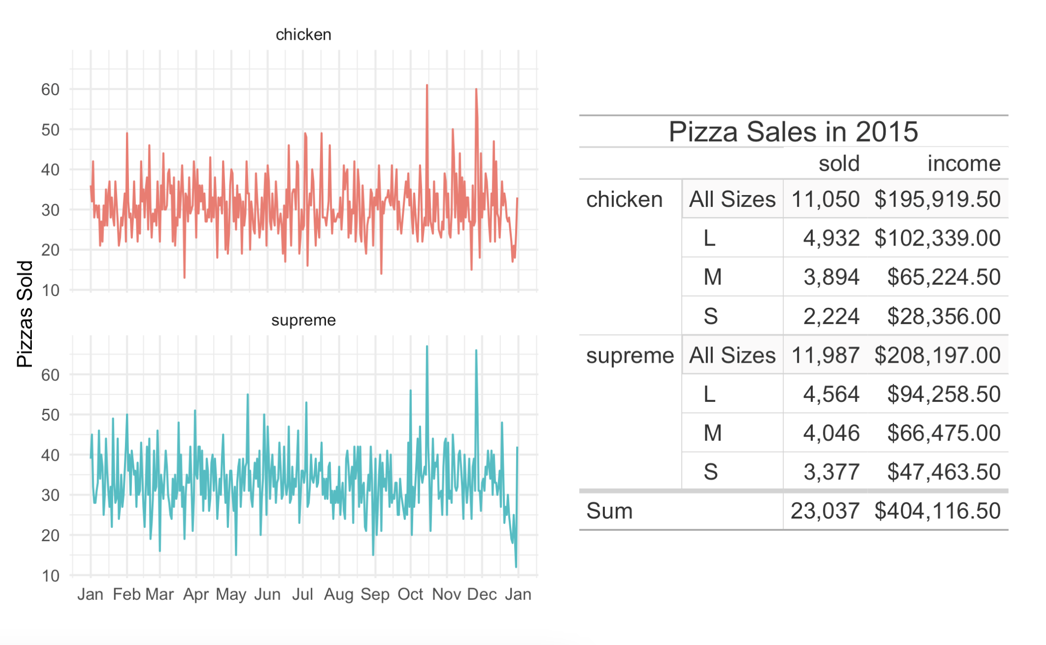
Thanks to the work done by Teun van den Brand (@teunbrand), we now have a function for rendering a table as grid graphics: as_gtable(). With some additional help from the brilliant patchwork package, we can easily combine plots and tables. Let’s first make a summary table based on the venerable pizzaplace dataset:
With patchwork loaded, we can combine the plot and the table like this:
pizza_plot + pizza_gtable
This is a great new feature and we hope you get a lot of value out of it!
New datasets
Datasets are great. We can’t get enough of them. Owing to this, we went ahead and added six more datasets to the package (bringing the total number to 18). The new datasets are:
peeps: A table of personal information for people all over the world
films: Feature films in competition at the Cannes Film Festival
gibraltar: Weather conditions in Gibraltar, May 2023
reactions: Reaction rates for gas-phase atmospheric reactions of organic compounds
photolysis: Data on photolysis rates for gas-phase organic compounds
nuclides: Nuclide data
Why do we keep adding datasets? Well, they’re great for examples! This new version of gt has a lot more examples per function within the docs. We find that an abundance of examples is both instructive and inspirational, so we’ll keep on adding them.
Oh, and the metro dataset (available since v0.9.0: March 31, 2023) has been updated as well. The reason? Six new Line 11 stations opened on June 13, 2024 so we quickly ensured those were added to this wondrous dataset.
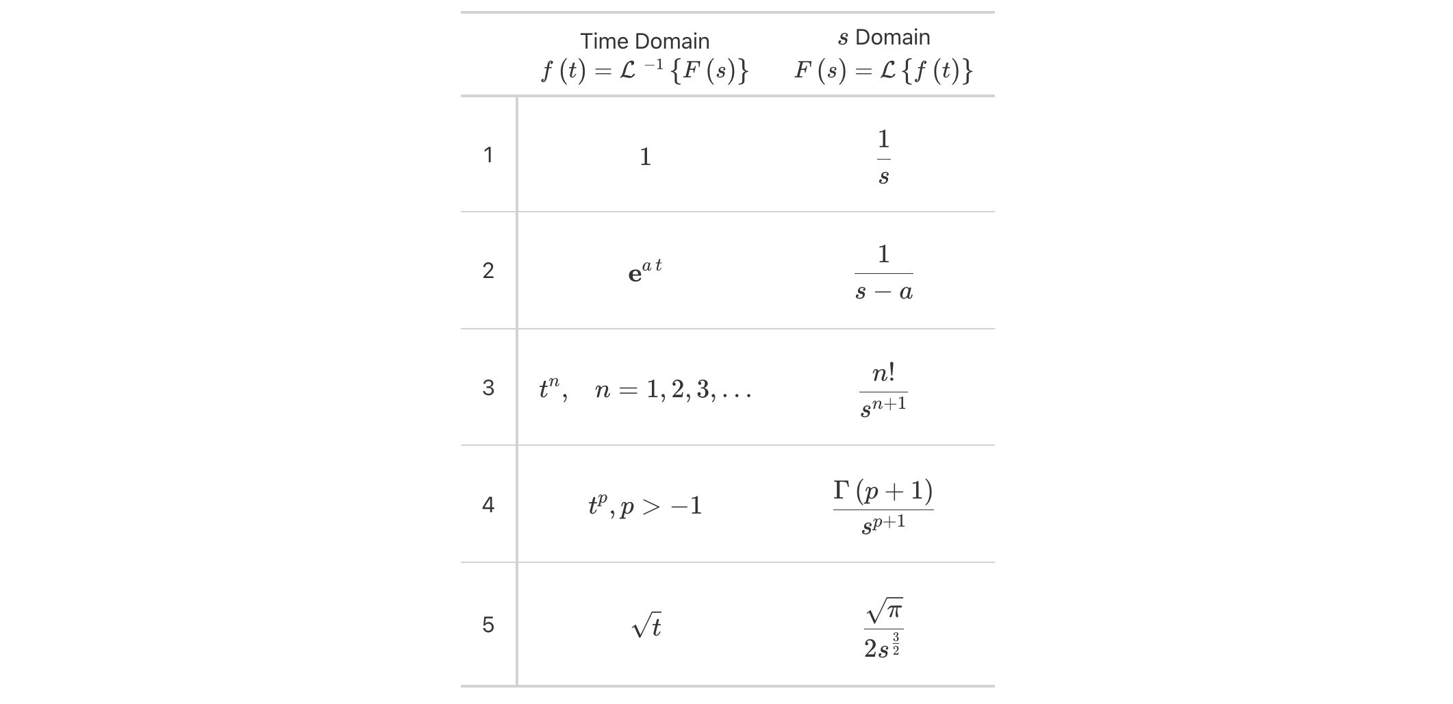
LaTeX formula support in HTML, and it’s good!
Some people want to include math in their HTML tables and that’s fair. Now, when you have LaTeX math, we can use fmt_markdown() (for math in the table body) or md() (for math in new labels outside the table body) and we’ll get dependency-free and nicely-typeset math in the output table. You can either set the math within "$" (for inline mode) or "$$" (for display mode).
Here’s an example where mathematical formulas are present within the table body and also within the column labels:
Laplace transforms have always been nicely presented as tabulations and now they can be beautifully rendered inside of HTML tables made with gt.
LaTeX tables are so much better now
For users producing LaTeX output tables, there is good news in gtv0.11.0: there is much better support for structuring and styling (closer to what’s available in HTML output tables), and a plethora of bugs where addressed. Virtually all of this work was expertly performed by Ken Brevoort (@kbrevoort), and we certainly appreciate the time and effort put into it.
Here’s an example of a simple LaTeX table render that uses styling that was otherwise not rendered in previous versions of gt.
So, for those users that were less impressed by what LaTeX output could do… try it out now! And certainly, feel free to file an issue for anything that could be further improved.
New formatting functions
One thing gt has a lot of is formatting functions. These are functions of the form fmt_*(), and they give you a lot of power to transform inputs in cells into all sorts of useful representations. There are four new formatters in gtv0.11.0:
fmt_chem(): format chemical formulas or chemical reactions
fmt_email(): format email addresses to generate ‘mailto:’ links
fmt_country(): generate country names from their corresponding country codes
fmt_tf(): format TRUE and FALSE values
Let’s look at several examples to see how these formatting functions work in practice.
fmt_chem()
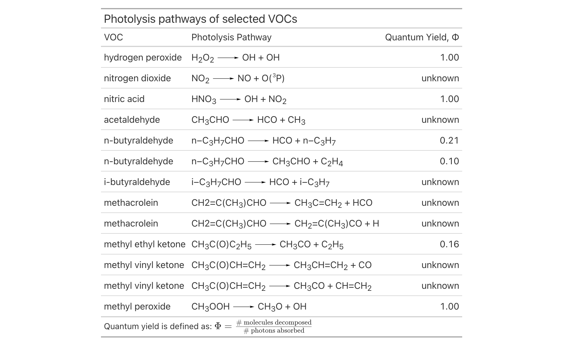
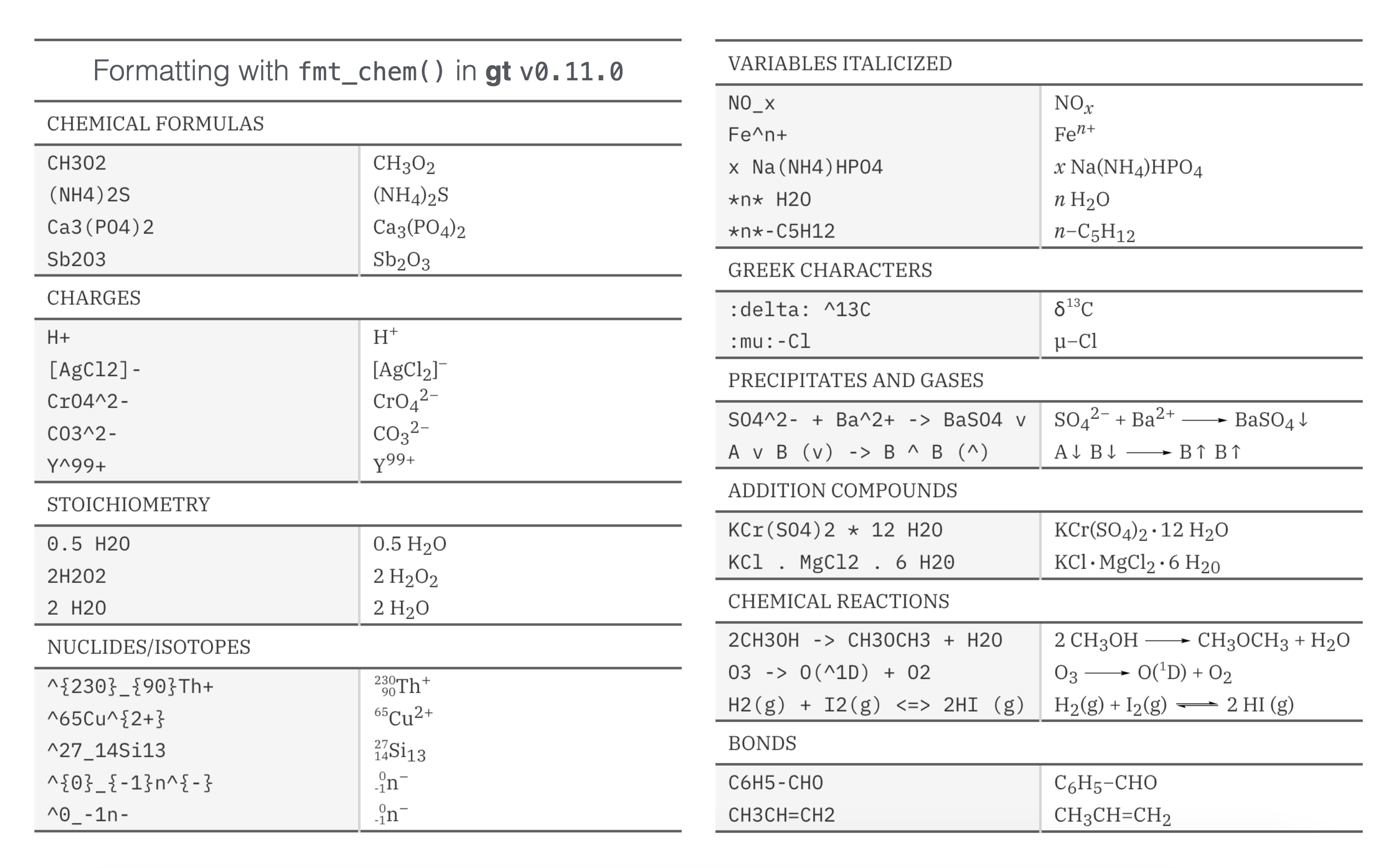
The new fmt_chem() function makes it easy to format chemical formulas or even chemical reactions in the table body. You might have single compounds that need formatting (e.g., "C2H4O", for acetaldehyde), or, there could be a need to format chemical reactions (e.g., "2CH3OH -> CH3OCH3 + H2O"). There’s a lot that fmt_chem() does to make chemistry look its best in a table! Here’s an example using the new photolysis dataset:
The upgrades to chemistry notation in gt allow for beautiful tables with chemical data formatted to the conventions of the field. And there is much more beyond this, including:
expression of charges with terminating "+" or "-" characters (e.g., "H+", "[AgCl2]-", "Y^{99+}", etc.)
use of stoichiometric values (e.g., "2H2O2", "1/2 H2O", etc.)
styling to fit conventions (e.g., "NO_x", "x Na(NH4)HPO4", "*n*-C5H12", etc.)
formatting of chemical isotopes like this: "^{227}_{90}Th", "^{0}_{-1}n^{-}", and "^0_-1n-"
a variety of reaction arrows: (1) "A -> B", (2) "A <- B", (3) "A <-> B", (4) "A <--> B", (5) "A <=> B", (6) "A <=>> B", or (7) "A <<=> B"
center dots for addition compounds can be added by using a single "." or "*" as in "KCr(SO4)2 . 12 H2O" or "KCr(SO4)2 * 12 H2O"
single and double bonds with "-" or "=" between adjacent characters; two examples: "C6H5-CHO" and "CH3CH=CH2"
inclusion of Greek letters by surrounding the letter name with colons; here’s an example that describes the delta value of carbon-13: ":delta: ^13C"
Here’s how that all looks in a reference table:
If you have a need to include chemistry in your gt table, please try out this new functionality!
fmt_email()
While fmt_url() is a suitable function for creating links from URLs, there wasn’t a comparable formatting function for handling email addresses. We added the fmt_email() function for this task and the rendered email addresses can now interact properly with email clients on the user system.
Let’s take ten rows from the peeps dataset and create a table of contact information with mailing addresses and email addresses. With the column that contains email addresses (email_addr), we can use fmt_email() to generate ‘mailto:’ links. Clicking any of these formatted email addresses should result in new message creation (though this can depend on the OS integration with an email client).
There are also many possibilities for further display customization like displaying the names of the email recipients instead of the email addresses (by using the from_column() helper in the display_name argument). Check out the documentation in ?fmt_email for many such examples!
fmt_country()
Tables that have data split across countries often need to have the country name included. While this seems like a fairly simple task, it really is not. Being consistent with country names can be fraught with difficulty.
This is where fmt_country() comes in. This new formatting function will supply a well-crafted country name based on a 2- or 3-letter ISO 3166-1 country code in the input. The resulting country names have been obtained from the Unicode CLDR, which is a good source since all country names are agreed upon by consensus. Furthermore, the country names can be localized/translated to any of 574 different locales via the function’s locale argument.
Let’s look at an example that uses the new films dataset. Here, fmt_country() resolves country codes in the countries_of_origin column and the function can handle multiple country codes per cell so long as they’re delimited by commas (as they are here).
films |> dplyr::filter(year ==1959) |> dplyr::select( title, run_time, director, countries_of_origin, imdb_url ) |>gt() |>tab_header(title ="Feature Films in Competition at the 1959 Festival") |>fmt_country(columns = countries_of_origin, sep =", ") |>fmt_url(columns = imdb_url,label = fontawesome::fa("imdb", fill ="black") ) |>cols_merge(columns =c(title, imdb_url),pattern ="{1} {2}" ) |>cols_label(title ="Film",run_time ="Length",director ="Director",countries_of_origin ="Country" ) |>opt_vertical_padding(scale =0.5) |>opt_horizontal_padding(scale =2.5) |>opt_table_font(stack ="classical-humanist", weight ="bold") |>opt_stylize(style =1, color ="gray") |>tab_options(heading.title.font.size =px(26))
Feature Films in Competition at the 1959 Festival
Film
Length
Director
Country
Araya
1h 30m
Margot Benacerraf
Venezuela, France
Compulsion
1h 43m
Richard Fleischer
United States
Eva
1h 32m
Rolf Thiele
Austria
Fanfare
1h 26m
Bert Haanstra
Netherlands
Miss April
1h 38m
Göran Gentele
Sweden
Arms and the Man
1h 40m
Franz Peter Wirth
Germany
Hiroshima mon amour
1h 30m
Alain Resnais
France, Japan
Court Martial
1h 24m
Kurt Meisel
Germany
The Soldiers of Pancho Villa
1h 37m
Ismael Rodríguez
Mexico
Lajwanti
2h
Narendra Suri
India
The 400 Blows
1h 39m
François Truffaut
France
Honeymoon
1h 49m
Michael Powell
United Kingdom, Spain
Bloody Twilight
1h 28m
Andreas Labrinos
Greece
Middle of the Night
1h 58m
Delbert Mann
United States
Nazarín
1h 34m
Luis Buñuel
Mexico
Black Orpheus
1h 40m
Marcel Camus
Brazil, France, Italy
A Home for Tanya
1h 40m
Lev Kulidzhanov
USSR
Policarpo
1h 44m
Mario Soldati
Italy, France, Spain
Portuguese Rhapsody
1h 26m
João Mendes
Portugal
Room at the Top
1h 57m
Jack Clayton
United Kingdom
A Midsummer Night's Dream
1h 16m
Jirí Trnka
Czechoslovakia
The Snowy Heron
1h 37m
Teinosuke Kinugasa
Japan
Stars
1h 31m
Konrad Wolf
East Germany, Bulgaria
The Sinner
1h 30m
Shen Tien
Taiwan
The Diary of Anne Frank
3h
George Stevens
United States
Desire
1h 35m
Vojtech Jasný
Czechoslovakia
Train Without a Timetable
2h 1m
Veljko Bulajic
Yugoslavia
Sugar Harvest
1h 17m
Lucas Demare
Argentina
Édes Anna
1h 24m
Zoltán Fábri
Hungary
The fmt_country() function is super powerful and can even resolve countries that no longer exist! Historical country codes like "SU" (‘USSR’), "CS" (‘Czechoslovakia’), and "YU" (‘Yugoslavia’) are resolved, which is a nice touch.
fmt_tf()
It completely escaped us that tables may contain TRUE/FALSE values (i.e., logical values) that are in need of formatting. That situation is remedied in v0.11.0 of gt with the new fmt_tf() function. With this formatter we let you resolve logicals to a number of preset (yet customizable) combinations of words or symbols.
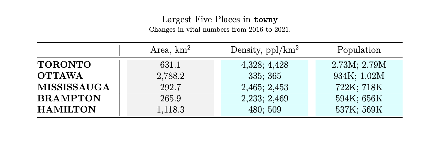
Let’s have a look at two examples. The first is of a table of small towny towns/villages/hamlets. There are two TRUE/FALSE columns: (1) does this tiny place have a website? and (2) has the population increased? Each of these fmt_tf() calls will either produce "yes"/"no" or "up"/"down" strings (set via the tf_style option).
Like the fmt_country() function (and many others previously added), fmt_tf() has a locale argument for localizing any word-based formatting outputs to a wide range of languages.
Here’s another example, this time using up and down arrow icons. The premise is that a logical value could denote whether something increased or decreased. In the case of this sp500 data, it’ll be shown whether the daily close price was higher than the open price. We can even assign colors to the arrows through the colors argument (super useful).
This type of formatting can help provide quicker insights into the data and we’re hoping you’ll find it useful for some of your table-making tasks.
In closing
There’s so much great new stuff in gt so try out v0.11.0 and let us know what you think! Talk with us by filing an issue, or ask us anything in the GitHub Discussions.
You can keep up with us by following the engaging @gt_package account on X/Twitter! There’s also a Discord server, and we do like to talk tables there, so join us!