Welcome to our first blog post on plotnine. With plotnine 0.13 having been available for a few weeks and having some minor patches, we’re excited to explore the layout improvements that it brings.
Let us set the stage with some context.
The Goal
The primary objective for plotnine is to implement the Layered Grammar of Graphics in Python, ensuring an API that mirrors ggplot2 as closely as possible, given the language constraints. While there are intentional differences, they are designed to not obstruct the user that is familiar with ggplot2.
From the first release, we have had a well-implemented pipeline that handles the “Grammar of Graphics.” This is responsible for the elements that are rendered within the plotting area.
The center
The common adorning elements (plot_title, axis_titles, and legend) that help with the interpretation and presentation of the overall graphic also worked well if they retained their default positions. All could only be center-aligned with respect to the panels.
The Layout Challenges
Venturing beyond the defaults often led to less-than-ideal outcomes. Successful outcomes were by happenstance. Specifically, the legend — despite its flexibility to be positioned on any of the four sides of the plot — was best suited on the right side. Positioning the legend on the left, top, or bottom would frequently result in an overlap with the axis or title texts in those areas.
There was a finicky solution where, by trial and error, you carefully adjusted space and pinpointed the precise positions for the various elements. This is how you ensured that objects neither overlapped one another nor were cropped at the figure’s boundaries.
In faceted plots, when there was axis text in the gutters between panels, it often encroached upon and overlapped with the area of the adjacent panel.
This, too, had to be resolved by finicky adjustments.
The problem was that plotnine lacked precise control over the spatial layout of the figure. This affected the placement of essential elements such as the plot title, caption, and axis titles along the edges of the panels. It also affected axis texts between adjacent panels. With these challenges, we could not incorporate a subtitle.
The underlying issue was matplotlib, which we use to render the graphics, did not have the flexibility we needed. This changed with matplotlib 3.6, which introduced the capability to design a custom layout manager.
The Layout Manager
In plotnine 0.12, we added a custom layout manager, and we finally got the ability to effortlessly produce well-arranged graphics. This eliminated the need for the finicky adjustments.
Equally significant, we could now create graphics with the exact size specified in the theme. For instance, setting theme(figure_size=(11, 8), dpi=100), where the size is inches, you get an 1100 x 800 point graphic image and not one approximately that size.
The layout manager has brought further enhancements. In plotnine 0.13, the latest version, we have leveraged it to refine and simplify control over the figure’s appearance.
Aligning elements along the edges of the plot is now straightforward.
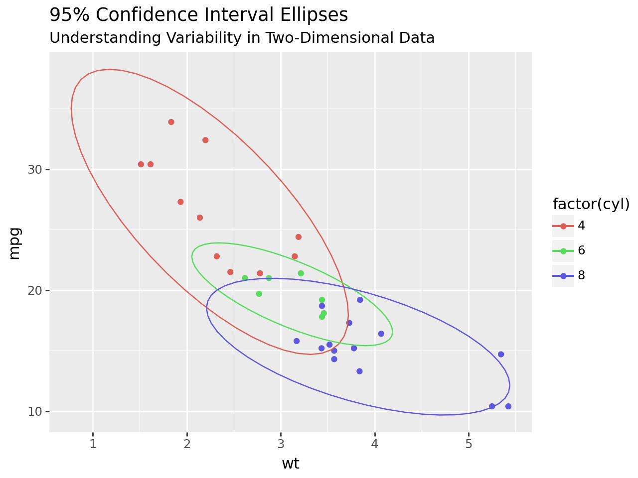
In plotnine 0.12, we added a subtitle. Subtitles tend to look best if they are left-justified, and this was the default; then, plot titles look best if they are aligned with the subtitles, so we changed their default position to be left-justified. However, we have not been able to get used to a left-justified title if there is no subtitle.
To address this, we have created flexible defaults: if a plot includes only a title, it will be centered; if a subtitle is also present, both will be left-justified. These settings serve as defaults, but individual text alignments can be adjusted independently, so you have full control when you need it.
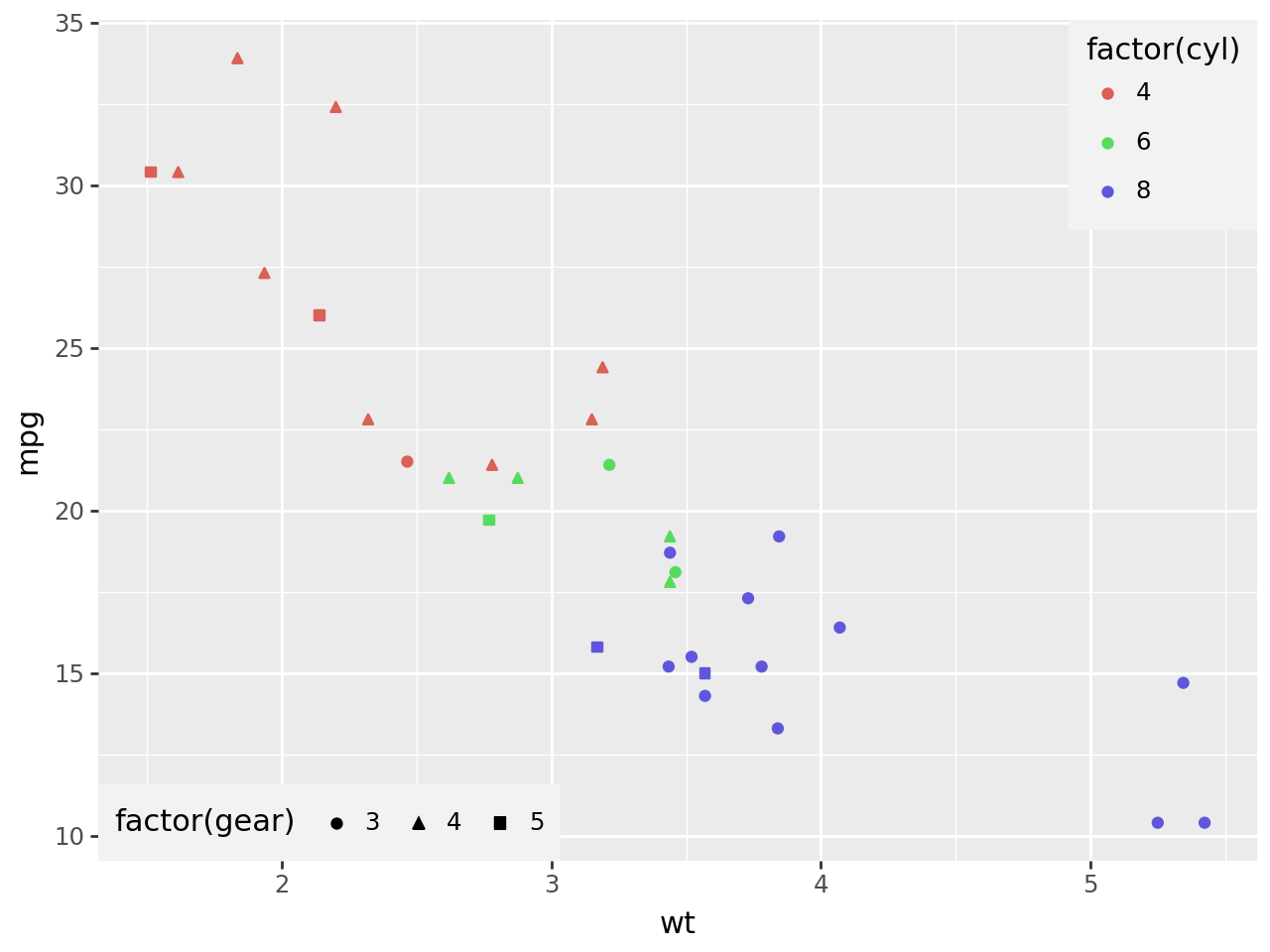
Additionally, we now have the capability to precisely align the legend along any chosen side. For example, below, we position the legend 1/4 from the bottom.
When positioning the legend 1/4 from the bottom, justification is determined by two reference points. In this case, the point 1/4 from the legend’s bottom aligns with a point 1/4 from the bottom of the panel. This concept mirrors the familiar alignment markers: bottom (0), center (0.5), and top (1), signifying the bottom of the legend aligning with the panel’s bottom, the center of the legend with the panel’s center, and the top of the legend with the panel’s top, respectively.
We can also justify the legend along any side that is placed. Here, we place it 1/4 from the bottom. Justification uses two points; here, the 1/4 point from the bottom of the legend is placed at a height 1/4 off the bottom of the panel. This makes sense if you think about justifying with the marks we are used to: bottom(0), center(0.5) & top(1) mean bottom of legend at the bottom of panels, the center of legend at the center of the panels, and the top of the legend at the top of the panels.
(ggplot(mtcars, aes("wt", "mpg", color="factor(cyl)"))+ geom_point()+ theme( legend_position="left", legend_justification_left=1/4, # or any number in the range [0, 1] ))
Justification is determined by two reference points. Above, the point 1/4 from the legend’s bottom aligns with a point 1/4 from the bottom of the panel. This makes sense if you think about the common alignments: bottom(0), center(0.5) & top(1) where the bottom of the legend aligns with the bottom of the panel, the center of the legend aligns with the center of the panel and the top of the legend aligns with the top of the panel.
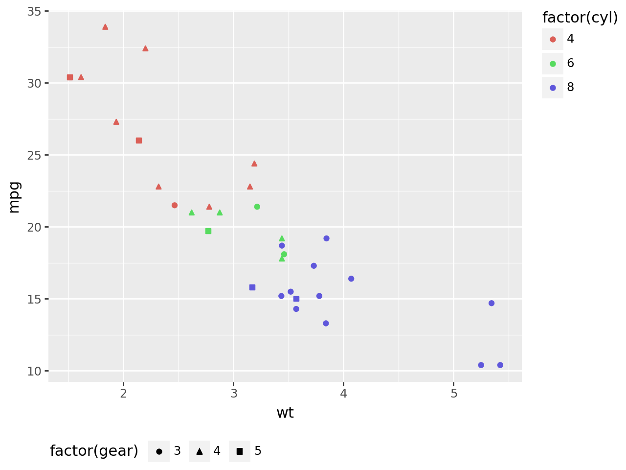
You can place the individual legends at different locations.
(ggplot(mtcars, aes("wt", "mpg", color="factor(cyl)"))+ geom_point(aes(shape="factor(gear)"))+ guides(shape=guide_legend(position="bottom", direction="horizontal"))+ theme( legend_justification_right="top", # This is the same as, 1 legend_justification_bottom="left", # This is the same as, 0 ))
Plus, you can place the legend(s) inside the panel area using a tuple with the coordinates.
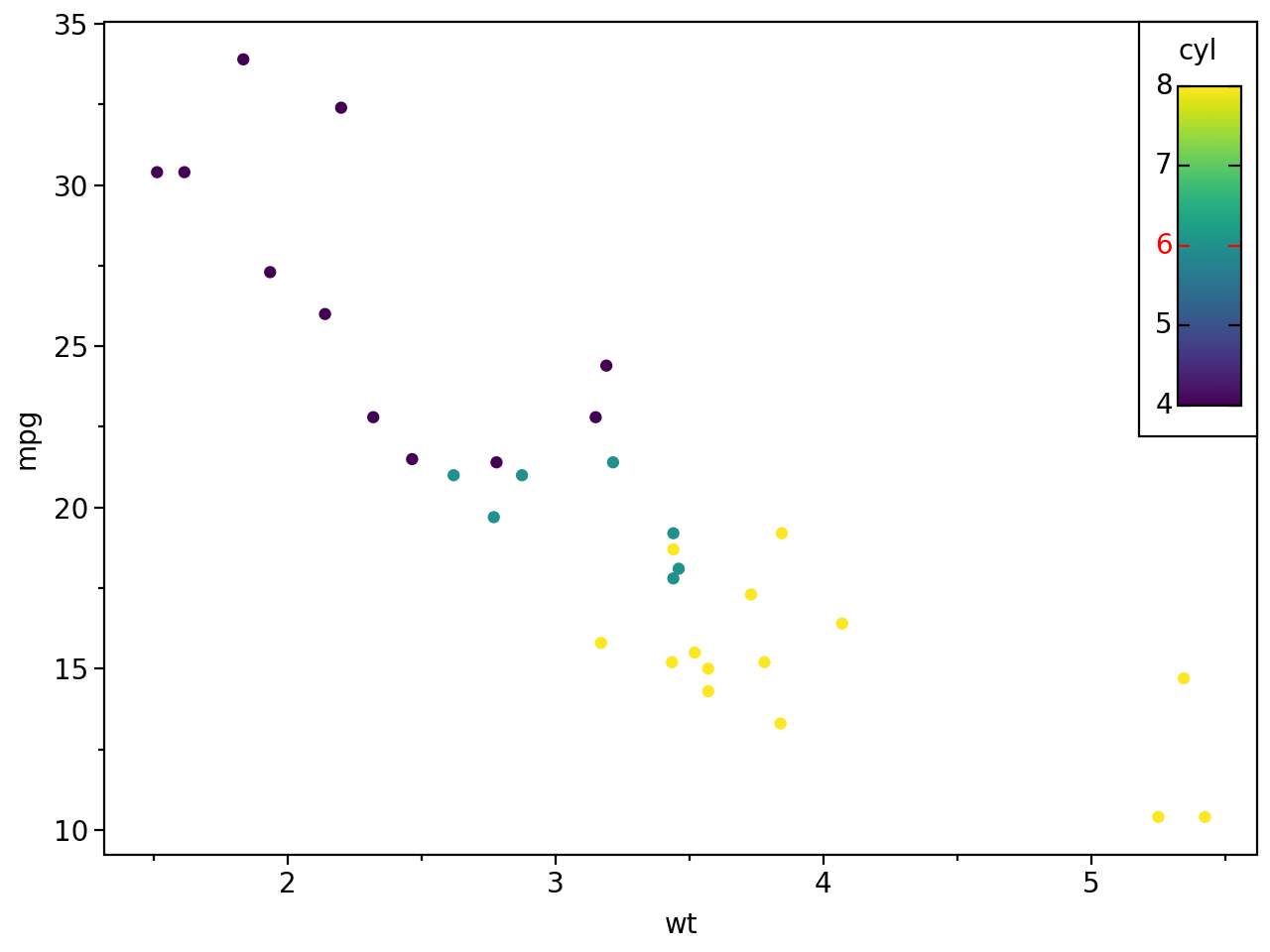
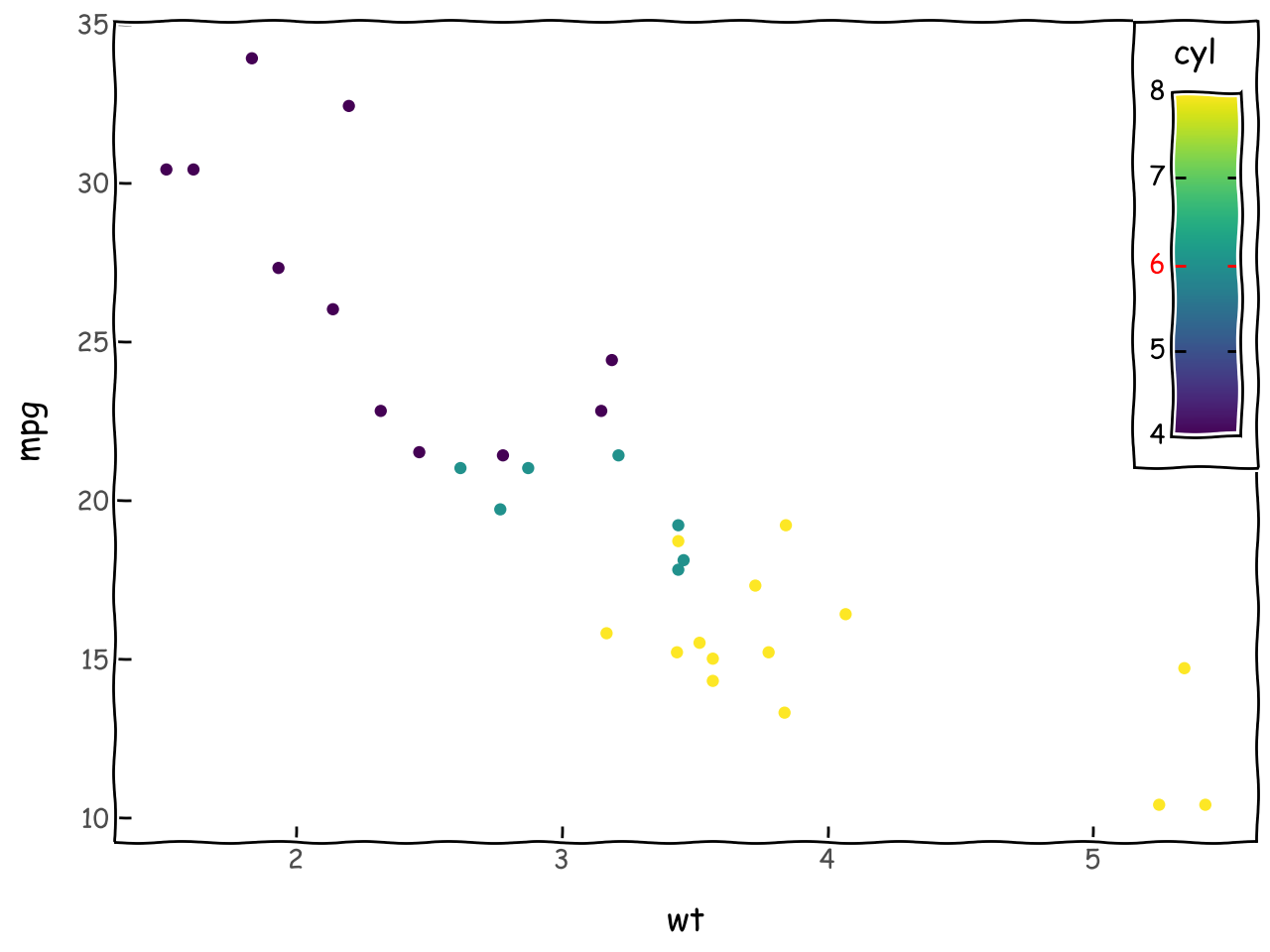
colors = ["black", "black", "red", "black", "black"]colors_doubled = [c for c in colors for i in (1, 2)](ggplot(mtcars, aes("wt", "mpg", color="cyl"))+ geom_point()+ theme_xkcd()+ theme( legend_position=(1, 1), legend_title=element_text(ha="center"), legend_text_position="left", legend_text_colorbar=element_text(color=colors), legend_ticks=element_line(color=colors_doubled), legend_background=element_rect(color="black"), legend_box_margin=5, legend_frame=element_rect(), ))
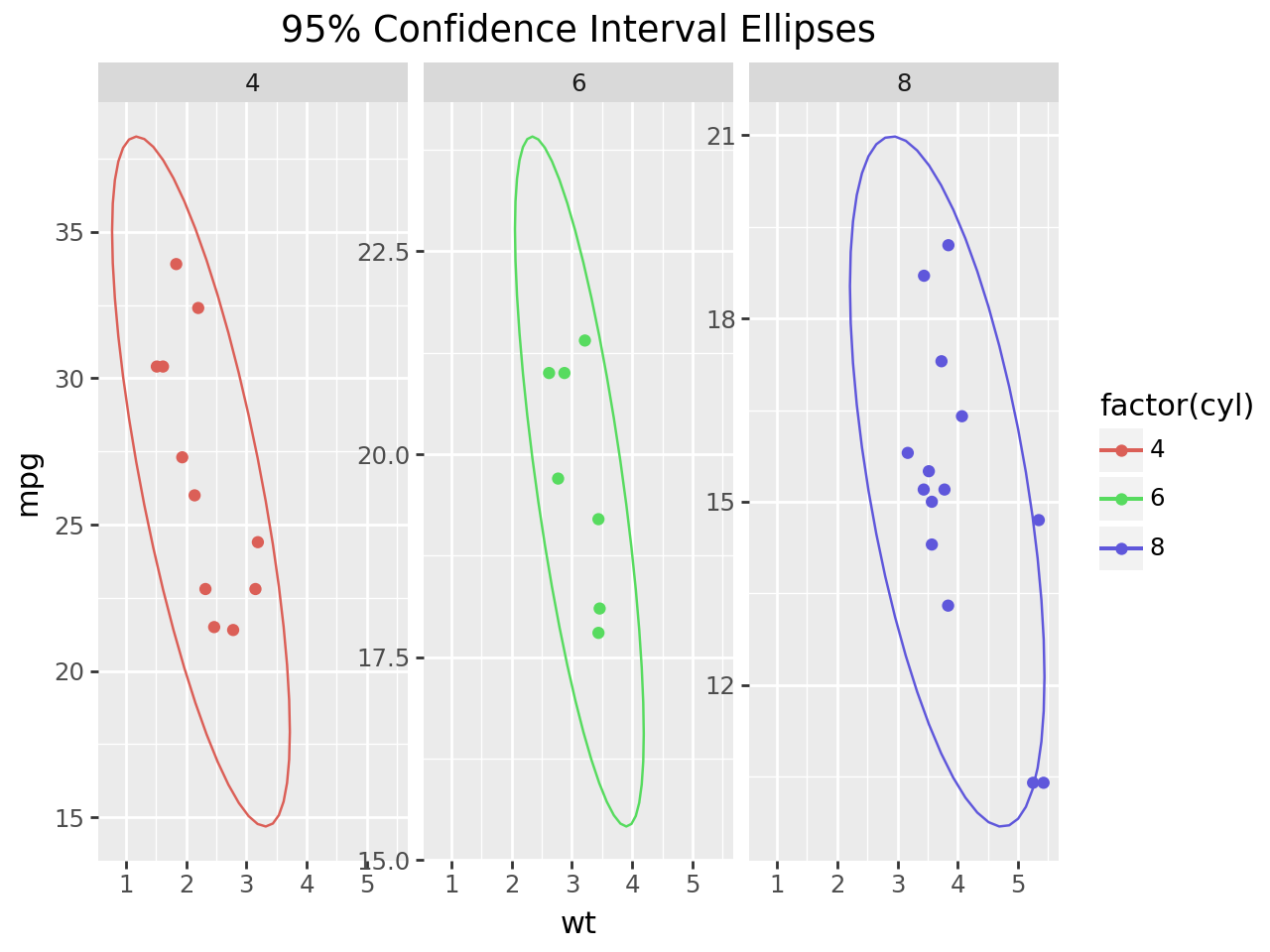
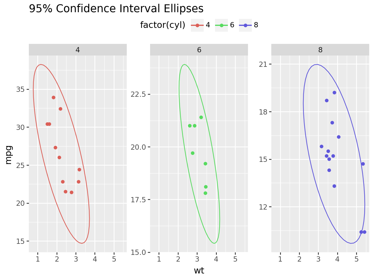
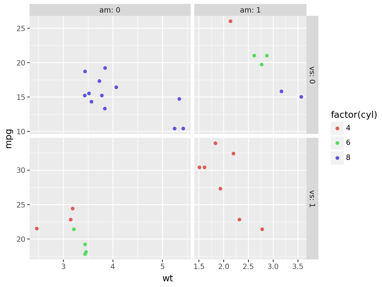
Elsewhere, the enhanced control over the layout of the figure has allowed us to create facet grids whose panels vary in size based on the range of the scale.
We have maintained the original compromise where you set the relative sizes of the panels.
Conclusion
The layout manager has been the most consequential addition to plotnine. It has made many inconvenient workarounds obsolete, and it has facilitated features that have given us more options to improve the presentation of plot graphics. But while the layout manager is capable of greater tasks, it is intricate and we have to carefully tame it and evolve it towards greater duties.
What tasks?
We prefer to ask the layout manager first, they are of the very particular kind.