Trusted by 52 of the fortune 100
Turn data science into business impact.
The enterprise platform for the AI era, giving data teams speed to build and IT the control to scale it safely.

Trusted by 10,000+ customers including


-
The data science code editor. AI-Powered, human driven.
Move from question to insight to analysis, model or application faster than ever before. Positron is the free code editor made specifically for data science and analysis with Python and R.
Play video Introducing Positron – The Data Science Code Editor - Short Version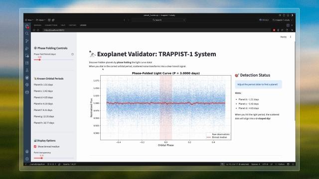
-
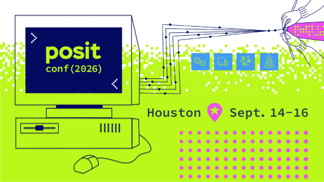
posit::conf(2026) in Houston this September!
Join us for three days of workshops, keynotes, talks, and community events.
-
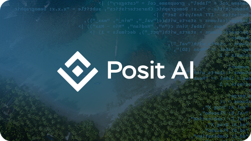
Posit AI: Think first. Code second.
Introducing an entirely new way to work with data. Posit AI embeds a specialized agent directly into Positron and RStudio, transforming your IDE into a powerful collaborator for data analysis.


Results
Outcomes you can measure, not just promise.
From faster insights to reduced risk, Posit customers achieve measurable impact across industries.

The Posit Platform
Enable faster time-to-insight through a unified data science environment, apps publishing, and governance.
Develop & Iterate with Speed


Drive Cost-Effectiveness
Govern & Securely Manage

Partnering with the best data platforms
See how leaders drive impact with Posit


Our mission
We help the world make sense of data.
As a Public Benefit Corporation, we're committed to open source, your freedom of choice, and being a long-term partner you can count on. No vendor lock-in. No exit strategy. Just tools that work.

All the resources you need to accelerate your data science journey

