Conveying results to others effectively is a fundamental part of research. Bespoke interactive data visualisations are increasingly popular with researchers because they communicate results in a way that lets others engage the data directly, rather than through the fixed lens of a static article.
Making Research Data Visible at Oxford
IT Services, at the University of Oxford is helping academics to create interactive data visualisations for their websites and publications. These visualizations help explain the meaning and relevance of research, and encourage others to reuse data.

The Solution
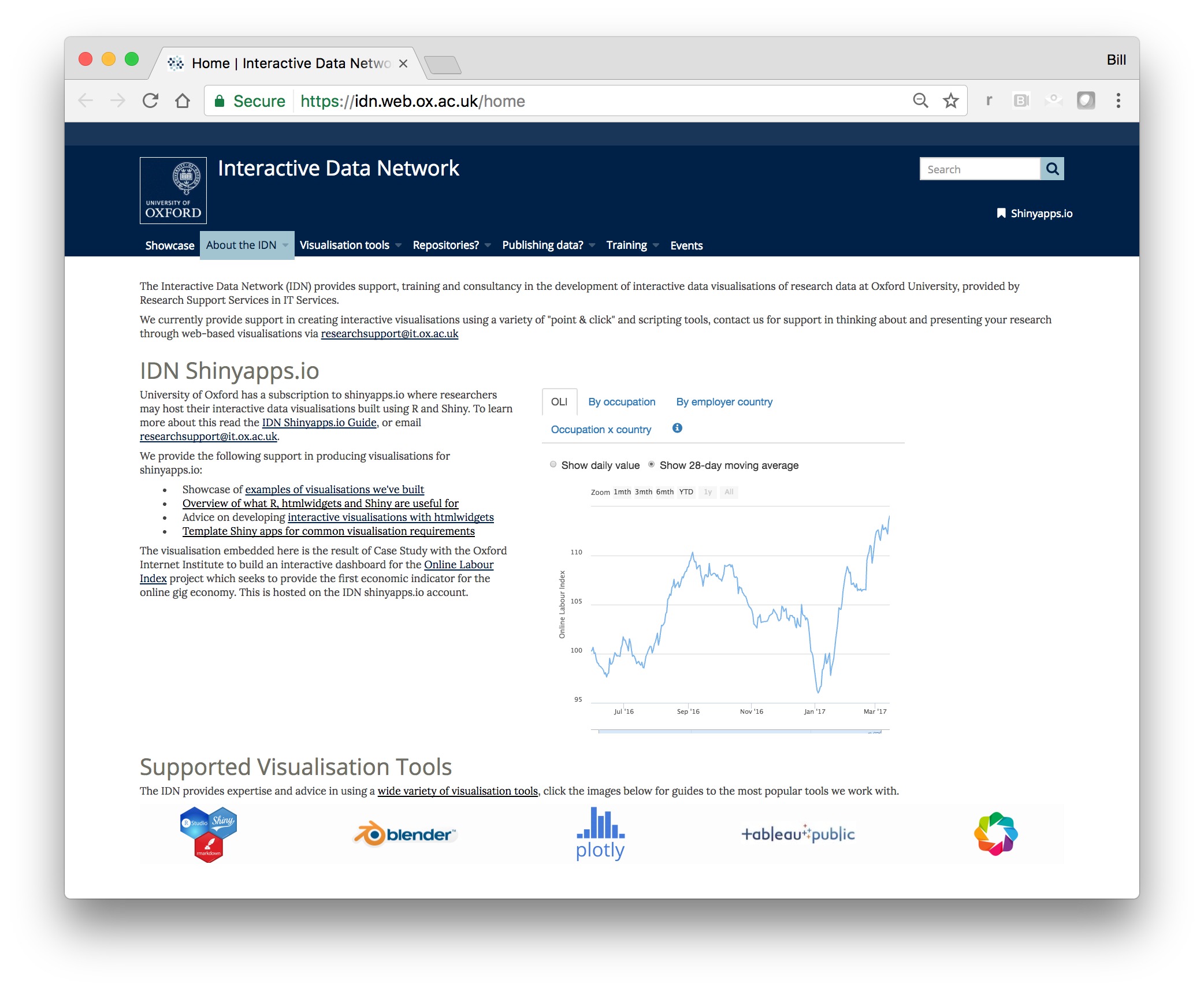
Using R, the RStudio IDE, Shiny and shinyapps.io, the team created pre-built Shiny app templates and tutorials for interactive tables, a range of charts, maps, and network diagrams. Our goal is to continuously reduce the time and effort needed, whilst broadening the range of data visualizations we can support.
We do not upload research data to shinyapps.io, instead the latest version of a dataset is always pulled from a recognized data repository e.g. the University’s Ora-Data service, Figshare or Zenodo. This means we always visualise data fully referenced with an Orcid ID, DOI, metadata etc.
Why Posit?
We chose RStudio / Shiny because:
- There are a large number of R users at the University
- The R developer community is very active, and constantly improving and adding features
- It is possible to create wide range of visualizations without needing javascript / HTML
- The Shiny server software is provided as a cost-effective hosted service, and can be migrated to on-premise in the future if need be e.g. for integration with institutional login
Next Steps
Our current development focus is visualization of larger and relational datasets i.e. where the dataset cannot be loaded into browser memory.
We are currently transitioning from project to service – to see our latest work visit the Interactive Data Network website(opens in a new tab).
Interactive Data Network website(opens in a new tab)
Online Labour Index Case Study
The Online Labour Index (OLI) is the first economic indicator that provides an online gig economy equivalent of conventional labour market statistics. It measures the utilization of online labour across countries and occupations by tracking the number of projects and tasks in real time. This case study sought to provide an interactive dashboard for tracking the change in the OLI overtime and broken down by occupation and worker location.
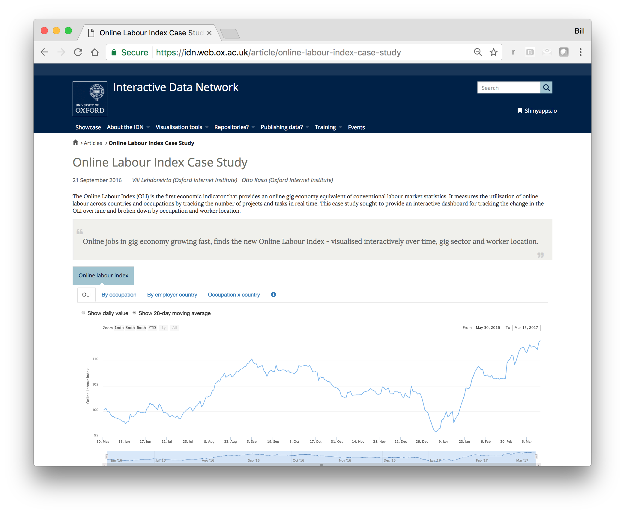
Online Labour Index (OLI)
Oxford Roman Economy Project Case Study
The Oxford Roman Economy Project is funded through the generosity of Baron Lorne Thyssen, previously the AHRC, to study and curate the fundamentals of the Roman imperial project across all major economic activities. This case study sought to investigate the cartographic and comparative visualisation capabilities of shiny as a tool for exploring two subsets of the OxRep database – shipwrecks and mines.
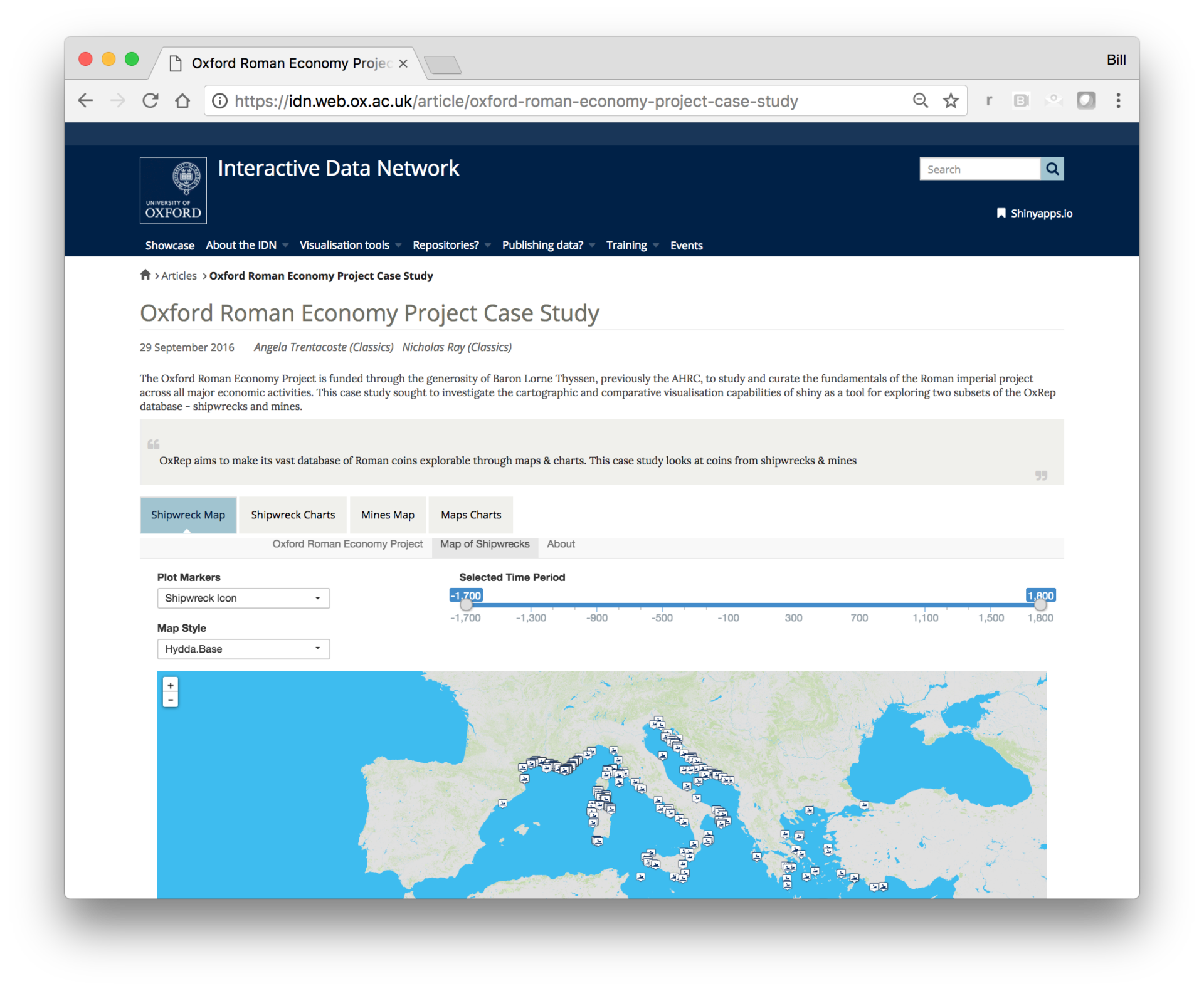
The Oxford Roman Economy Project is funded through the generosity of Baron Lorne Thyssen.