9 ways to use Posit Connect that you shouldn’t miss

TL;DR: Posit Connect can help you share insights in so many different ways. This post includes 9 (ok, maybe 10) updated examples to help ensure you are getting the most value out of your existing license.
In speaking with customers in the community, we hear so many ways that teams are driving decisions and positively impacting their organization (from a 2-person startup to a 100+ billion dollar enterprise) with Posit Connect. We love hearing your success stories.
New to Connect? What is it?
Posit Connect is a publishing platform for the authenticated sharing of data products. With Connect, it’s easy to share Shiny applications, Jupyter Notebooks, Quarto and R Markdown reports, Plumber and Flask APIs, Dash, Bokeh, Streamlit applications, Quarto projects, dashboards, plots, and more in one convenient place to bring the power of data science to your entire organization.
Here are 9 ways to use Posit Connect:
- Deploy pins to share data, models, and other Python or R objects across projects and with your colleagues
- Share a Quarto site about your internal data science community with new hires to bring them up to speed quickly about events & resources
- Schedule automated reports for business stakeholders
- Serve custom, individualized insights to stakeholders directly through Slack
- Build a custom landing page for business stakeholders to make content discovery easier
- Use an internally created package to standardize dashboards with consistent theming
- Use APIs to enable Tableau users at your company to leverage work done by your data science team in R and Python
- Check out the Connect Server API to utilize usage data that helps answer questions like: Is my CEO using this app?
- Deploy APIs that allow your team to work with front-end development teams using their preferred framework (e.g., React, Angular, Vue)
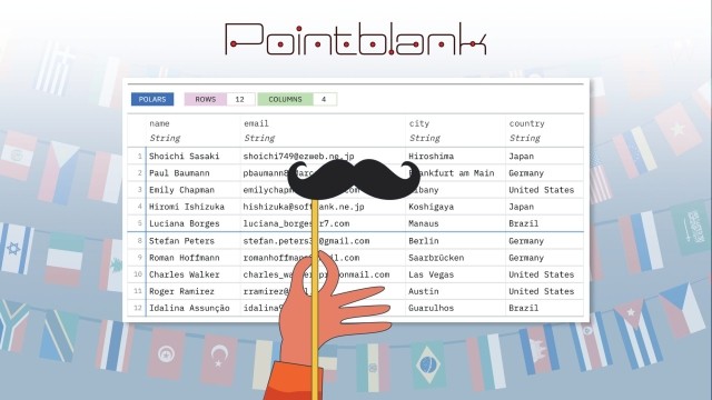
Deploy pins to share data, models, and other R or Python objects across projects and with your colleagues
The pins package publishes data, models, and other R or Python objects, making it easy to share them across projects and with your colleagues. Pins can be automatically versioned, making it straightforward to track changes, re-run analyses on historical data, and undo mistakes.

- Pins for R
- Pins for Python
- An example of how the City of Reykjavík uses pinned models in their Shiny app to show the capacity of pools with Hlynur Hallgrímsson.
Share a Quarto site about your internal data science community with new hires to bring them up to speed quickly about events & resources
Data science communities help us discover new capabilities, connect with others, and solve problems faster. They are incredibly important in growing a company’s analytics maturity while helping us create connections.
You can deploy a Quarto site to Connect to share recordings of past events, resources, ways to access tools, and more.
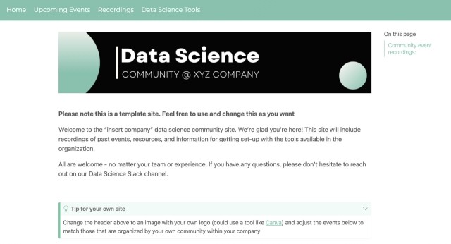
- Above is an example community site template Rachael Dempsey created.
- For more on building your own internal data science communities, check out this Quarto site.
Schedule automated reports for business stakeholders
Connect sits in a sweet spot for scheduling data science products. It provides flexibility and robustness while remaining easy to use. Data scientists are able to write code in Quarto, R Markdown, or Jupyter Notebooks and then publish and schedule those on Connect.
Once scheduled, Connect ensures content is run and handles logs, sending emails on errors and versioned history of prior runs. Data scientists can customize email notifications if they want to receive updates, such as a summary of newly processed data.
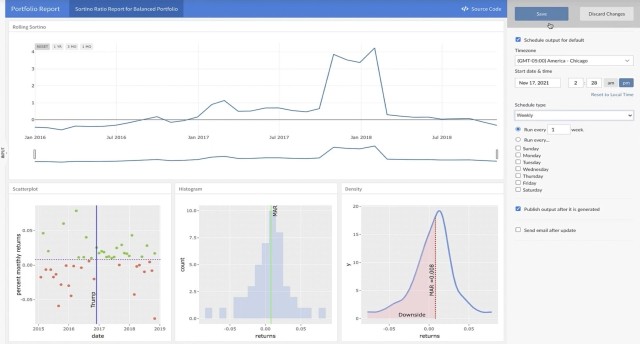
- Documentation on scheduling in the Connect User Guide
- Sample projects and code for more details
Serve custom, individualized insights to stakeholders directly through Slack
Serving stakeholders data at the moment they need it in an environment where they are already talking about business performance can help in democratizing information, especially when end-users are experiencing dashboard overload.
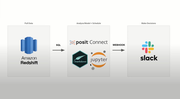
- Matthias Mueller’s blog post on how they did this at Campaign Monitor
- Meetup recording: Serving bespoke insights through automation
Build a custom landing page for business stakeholders to make content discovery easier
How do you ensure your audience finds what they need on Posit Connect without paging through the dashboard, remembering the right search terms, or bookmarking every content item you share?
After deploying many pieces of related content, how do you share them as a cohesive project?
Use an internally-created package to standardize dashboards with consistent theming
Here’s an example of how Snap Finance ensures a reproducible development workflow with a Shiny dashboard framework with Alan Carlson.
Using their internal package, the team is able to build dashboards the same way, reducing tech debt and simplifying code review. This allows their team to bring on new developers and have them become almost instant contributors. With standardization, their developers are spending more time actually developing instead of spending time spinning up a Shiny framework.
- Alan Carlson Meetup recording: Robust, modular dashboards that minimize tech debt
- Snap Finance Customer spotlight
Use APIs to enable Tableau users at your company to leverage work done by your data science team in R and Python
Posit Connect includes support for Tableau Analytics Extensions, which provide a way to create calculated fields in workbooks that can execute scripts outside of the Tableau environment. This Posit Connect integration enables you to create R or Python HTTP API extensions for use across all your Tableau workbooks.
Compared to existing methods for integrating R and/or Python in Tableau, integration via APIs hosted on Posit Connect provides better security and dependency management. James Blair led us through a demo of this in the meetup recording here.
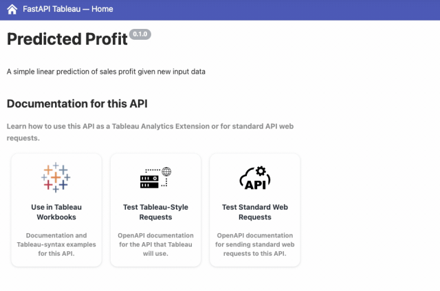
- James Blair’s Meetup recording: Leveraging R & Python in Tableau with Posit Connect
- Tableau Integration Documentation
- Blog post: Embedding Shiny Apps in Tableau using shinytableau
- Blog post: Tableau Analytics Extensions
Use the Connect Server API to get advanced usage metrics that answer questions like: Is my CEO using this app?
The Posit Connect Server API provides easy access to your server’s instrumentation data from when users visit your server. As a publisher or administrator, you have access to these data: who logged in, when they logged in, what they looked at, and how long they spent on that piece of content.
With connectapi (now on CRAN!), you can extend Connect and visualize advanced usage metrics that help answer important questions and focus your data science work. Here's a walk-through and resources to get started with Cole Arendt.

- Cole Arendt’s Meetup recording: Shiny usage tracking in Posit Connect
- Meetup slides
- Blog post with examples
Deploy APIs that allow your team to work with front-end development teams using their preferred framework (e.g., React, Angular, Vue)
As data science teams—and their applications—grow larger, teams can experience growing pains that make applications complex, difficult to customize, or challenging to collaborate across large teams.
You can use the Plumber package to deploy APIs to Posit Connect as part of a microservices architecture that allows your team to work with front-end development teams using their preferred framework (e.g., React, Angular, Vue).
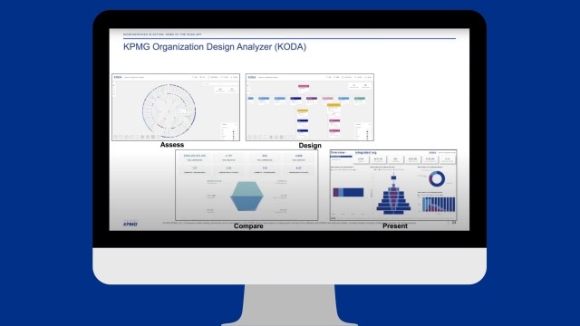
- Tom Schenk & Bejan Sadeghian’s Meetup recording: Making microservices part of your data team
- Meetup slides
…oh, and of course, for data visualizations.
As its name suggests, Connect is all about getting valuable information off the laptops of data scientists—and into the hands of decision-makers who can make a meaningful impact. Share your Streamlit, Dash, Shiny, and Bokeh apps directly with stakeholders.
- Posit Connect User Guide - content options
- Paul Chang’s Meetup Recording: Capacity Planning for Microsoft Azure Data Centers Using Posit Connect
Learn more
If you haven’t had a chance to try Posit Connect before, schedule a demo with our team to learn more!
Don’t just take our word for it. TrustRadius announced their list of Most Loved products—100 winners out of 29,000 candidates–and Posit’s products made the list.
