Three major updates to the Plotnine website


We're excited to announce three major updates to the Plotnine website that make it easier than ever to discover, learn, and master data visualization with Python's grammar of graphics library.
A complete homepage redesign
Among Python's many data visualization libraries, Plotnine stands out by bringing the elegant grammar of graphics to Python users. As a long-time fan of Plotnine, I was convinced it needed a homepage that truly showcases its power and flexibility; one that would inspire others to discover why mastering this library is such a valuable investment.
---Jeroen Janssens, developer relations engineer at Posit
The Plotnine homepage has been completely redesigned with a focus on inspiration over installation. Instead of immediately diving into setup instructions, you’re now greeted with a gallery showcasing the breadth of data visualizations possible with Plotnine. From elegant statistical plots to complex multi-panel displays, the new homepage demonstrates why Plotnine is the go-to choice for Python developers who want the power and flexibility of ggplot2.
After browsing the gallery, you continue with an overview of Plotnine's major features. This walkthrough guides you through creating a complete data visualization step by step, helping you understand not just what Plotnine can do, but how its grammar of graphics approach makes complex visualizations intuitive and reproducible.
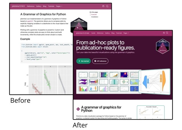
An enhanced gallery experience
The new Plotnine homepage and gallery look fantastic. The visualization of Anscombe’s Quartet perfectly illustrates the progressive way of how your plots take shape.
— Hassan Kibirige, creator of Plotnine, open source developer at Posit
The gallery itself has received a major upgrade, now featuring many outstanding data visualizations created during the 2024 Plotnine Plotting Contest. These contest entries showcase real-world applications and creative techniques that push the boundaries of what's possible with Plotnine.
Navigation has been greatly improved with the addition of tags for each gallery item. Whether you're looking for examples of specific plot types or certain styling approaches, the new tagging system helps you quickly find visualizations relevant to your use case. This makes the gallery not just a source of inspiration, but a practical reference for your own projects.
A comprehensive new user guide
As a heavy Plotnine user for the last decade, I can’t believe how freaky fast it gets me from thoughts in my head to plots on the screen. My hope is that the Plotnine User Guide shows how its grammar of graphics handles most use-cases in quick to code, elegant ways.
---Michael Chow, open source developer at Posit
Perhaps most importantly, the website now features a brand new user guide that serves as your complete reference for mastering Plotnine. This detailed guide walks through every aspect of the library, from fundamental concepts like aesthetic mappings and geometric objects to advanced topics like custom themes and statistical transformations.
The user guide is structured to support both newcomers learning the grammar of graphics for the first time and experienced users looking to refine their technique. Each concept is explained with clear examples and practical applications, making it easy to understand not just the "how" but also the "why" behind Plotnine's approach to data visualization.
What this means for you
These updates represent our commitment to making Plotnine more accessible and powerful for the entire Python data science community. Whether you're just getting started with data visualization or you're a seasoned analyst looking to create publication-ready graphics, the new homepage, enhanced gallery, and comprehensive user guide provide the resources you need to succeed.
Visit plotnine.org today to explore these updates and discover how the grammar of graphics can transform your approach to data visualization in Python.

Jeroen Janssens
Related Content

What makes Posit different from proprietary analytics vendors

The Test Set 1 Year
