Winner of the 2024 Plotnine Plotting Contest


Introduction
I am thrilled to announce the winners of the 2024 plotnine Plotting Contest!
On a personal note, developing open-source software can be a lonely task. I am physically quite distant from plotnine’s end-users, focused on answering issues online, delivering new features, and generally deep in code. As the community has grown, I’ve been amazed at the creativity, inventiveness and technical prowess with which plotnine is used.
This contest is an invitation to showcase the boundless breadth of people’s creativity. It has been incredibly rewarding for me, and in the three months since we announced it, I’ve identified several ways to improve the package and our documentation site.
Evaluation
Thank you to everyone who took part. I specifically loved the different fields from which the data was drawn. Judging submissions is incredibly difficult; we strive to be as objective as possible, but deciding on winners and various prize levels is partly subjective and subject to various biases. You can see all the submissions on the plotnine discussions page.
We recruited three judges to help with the evaluation. They were Daniel Chen (Data Science Educator & Developer Relations at Posit, GitHub, LinkedIn, Mastodon, website, X), Isabella Velásquez (Posit DevRel, Fosstodon, LinkedIn, website), and Isabel Zimmerman (Posit Software Engineer, Fosstodon, GitHub, LinkedIn, website). They scored each submission along four metrics.
- Aesthetics
- Technical Impression
- Code comments and/or narrative
- Creative bonus
I then weighted the per-metric scores and summed them up to get a final score. For good measure, I checked that the order of the top scores was not affected by small changes to the weights.
And, here are the winners!
The Winner
Weather Forecast Plot
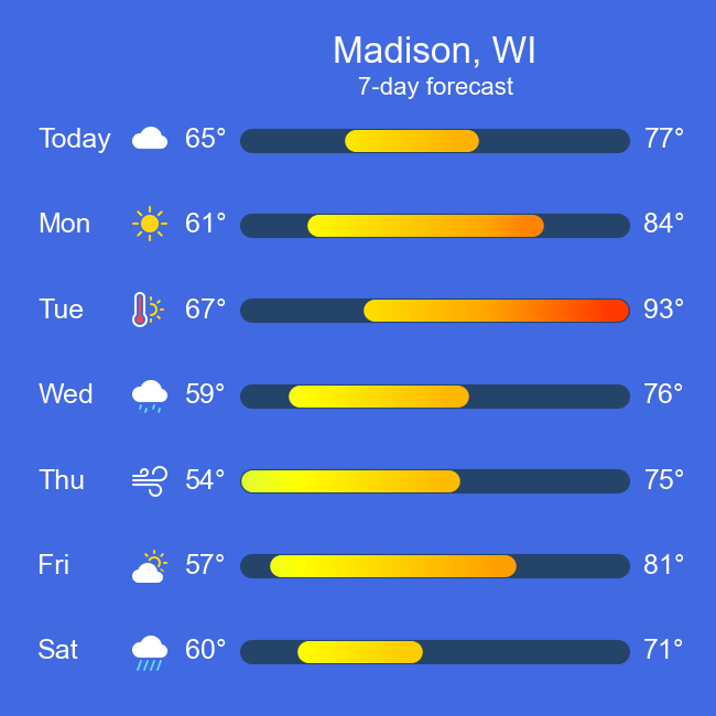
We are glad to announce John’s Weather Forecast Plot as the winner of the 2024 Plotnine Plotting Contest.
The judges remarked, “This is a creative use of plotnine to create a visualisation that looks like an actual weather application.” Initially, I was skeptical that it was made with plotnine, and I had to examine the code as it currently shouldn’t be possible to create line segments with a colour gradient. Remarkably, John managed to fake the effect of a gradient on a single segment, and in the submission, we see him exploring his way toward this effect, which is just one element of an exceptionally well-designed visualisation.
The headline plot in this submission is a weather forecast for Madison, WI, whose temperature range falls entirely within the sunny range, making the colours vibrant and the graphic visually striking. Beyond that, this submission simplifies generating forecasts for different locations. Here is a collection of multiple plots captured from the code repository.
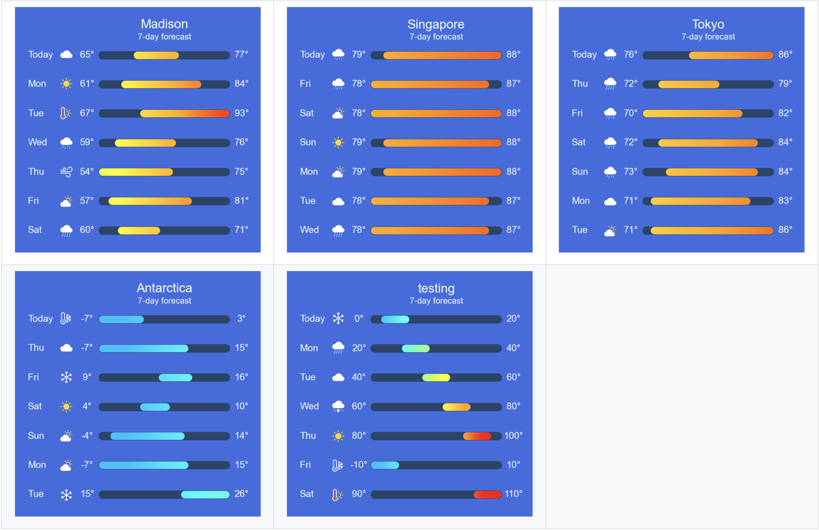
As a collection, these plots evoke a range of emotions. There is the satisfaction of having a reusable plotting function; the joy of working out which city we would prefer in those days, is it Madison, Singapore or Tokyo; the chilling angst when we imagine ourselves in Antarctica; then looking at the “testing” plot, we feel the dread of that bug that makes the segments go awry and overshoot their expected ranges, stirring some conditional empathy for the developer.
Visualisations do more than just present graphical information for interpretation; they can take us places. This is a power often overlooked in the realm of statistical graphics, and by crafting this conventional visualisation using unconventional means, we are reminded of that power.
The Runners Up
Coal Production Since 1900: Annotated Area Charts with plotnine
By Nicola Rennie - website, GitHub, Twitter, Mastodon, Bluesky, LinkedIn
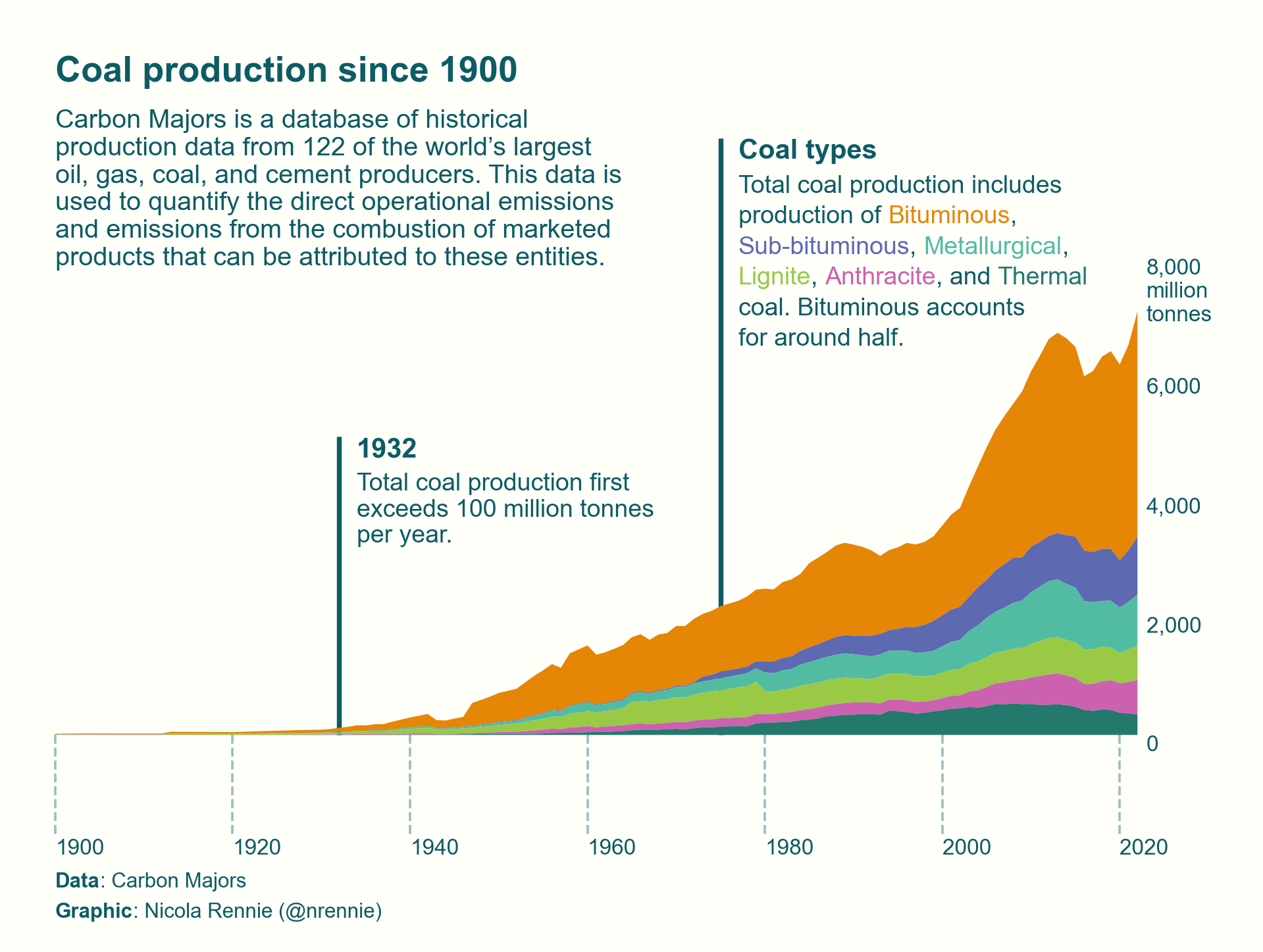
An area plot should not wow us; it is a common type of graph. Yet, this submission of an area plot does just that. The judges remarked, “It is self-explanatory, and moving the y-axis to the right was a brilliant decision, as that is where all the growth is, keeping the information cohesive so that the reader doesn’t have to track across the figure”. They also noted, “It is a beautiful plot with excellent use of colour, annotations, and lines.”
I want to also highlight and appreciate a subtle nuance in this visualisation. Axis ticks are typically short to avoid looking awkward, and horizontal axis labels are preferably centered on the short axis ticks for the same reason. In this case, the ticks are unusually long, but the oddness is mitigated by dashing the lines all so that the year labels can be left-aligned with respect to the lines to prevent any overlap with the previous year’s bounds. The subtlety of the thought, the deliberateness of the action, and the resulting effect are truly sublime.
Dimensionality Reduction, Animated
By Jeroen Janssens - Website, GitHub, Twitter LinkedIn,
This was the only animation among the submissions, and the judges praised both the process of creating the video and the visual style. The aesthetics of this animation evoke a sense of nostalgia, reminiscent of the retro visualisations that once supported the research and development of digit classification algorithms – those seemingly low-quality snapshots often found in early Machine Learning books.
Despite having to work around a bug caused by changes in an upstream dependency, this submission excels. It shows how effortlessly a domain-specific snapshot graphic can be transformed into an animation that captures the evolution of an entire system, significantly enhancing communication about such complex processes.
Honorable Mentions
Creating a Plotnine Mondrian
By Daniel Tan - GitHub, LinkedIn
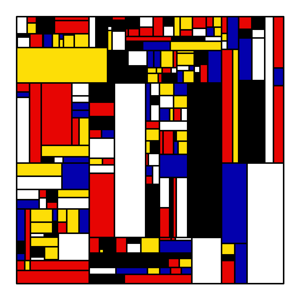
Generative art is a kind of magic, and this submission brings it out. Like a good magic trick that retains its magic even when you know how it is done, they mondrian maintains its allure.
Advanced Multi Axis Spider Chart
By Zvonimir Boban - GitHub LinkedIn
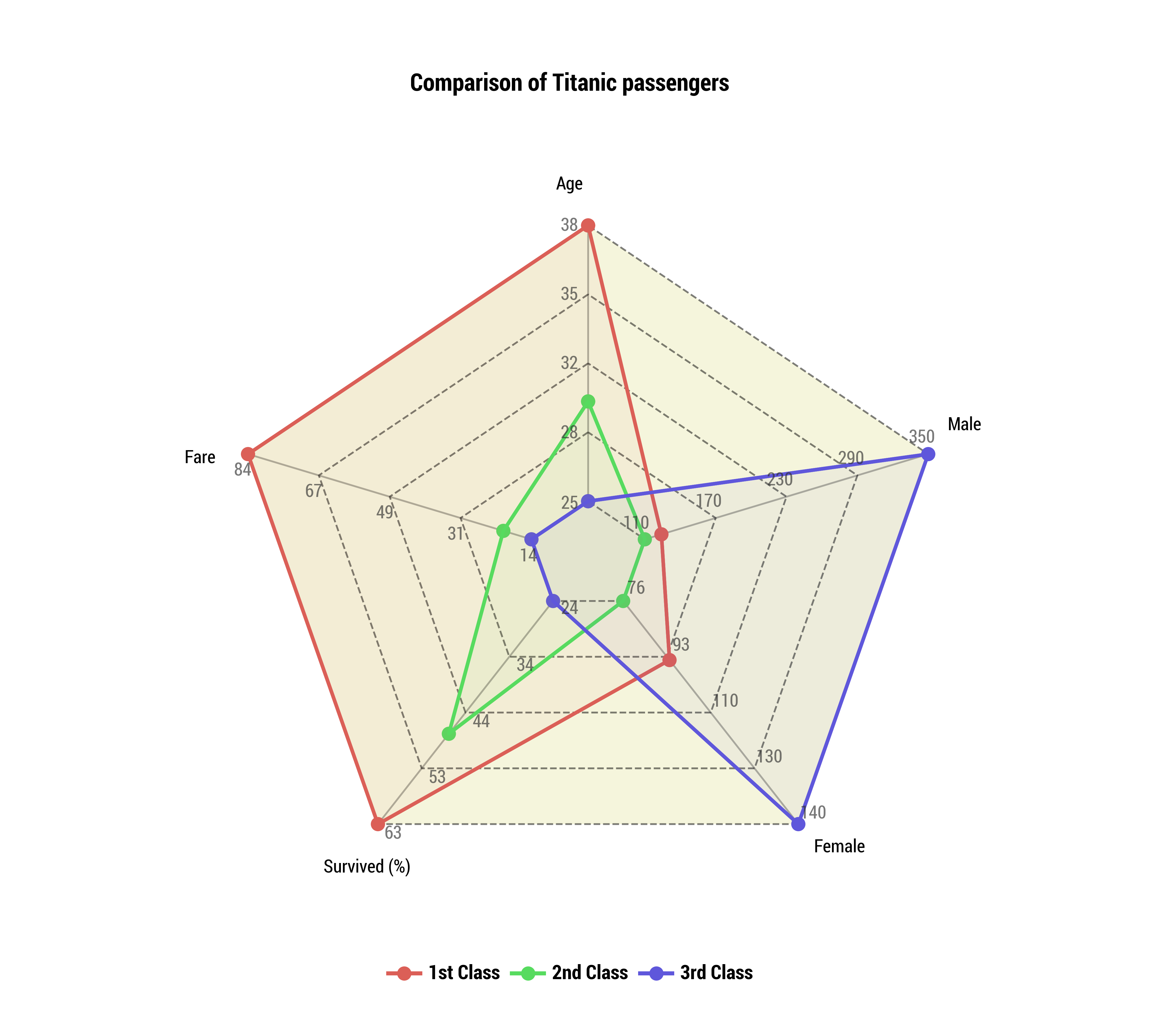
Spider plots have a unique appeal when visualising comparisons across multiple dimensionals. The spider web is its own coordinate system, and to see this implemented in a submission certainly tickled us.
Clockplot: visualizing sleep data around the clock!
By 1. Marco Dalla Vecchia - GitHub, Gitlab 2. Valeria Fonseca Diaz - GitHub, Gitlab
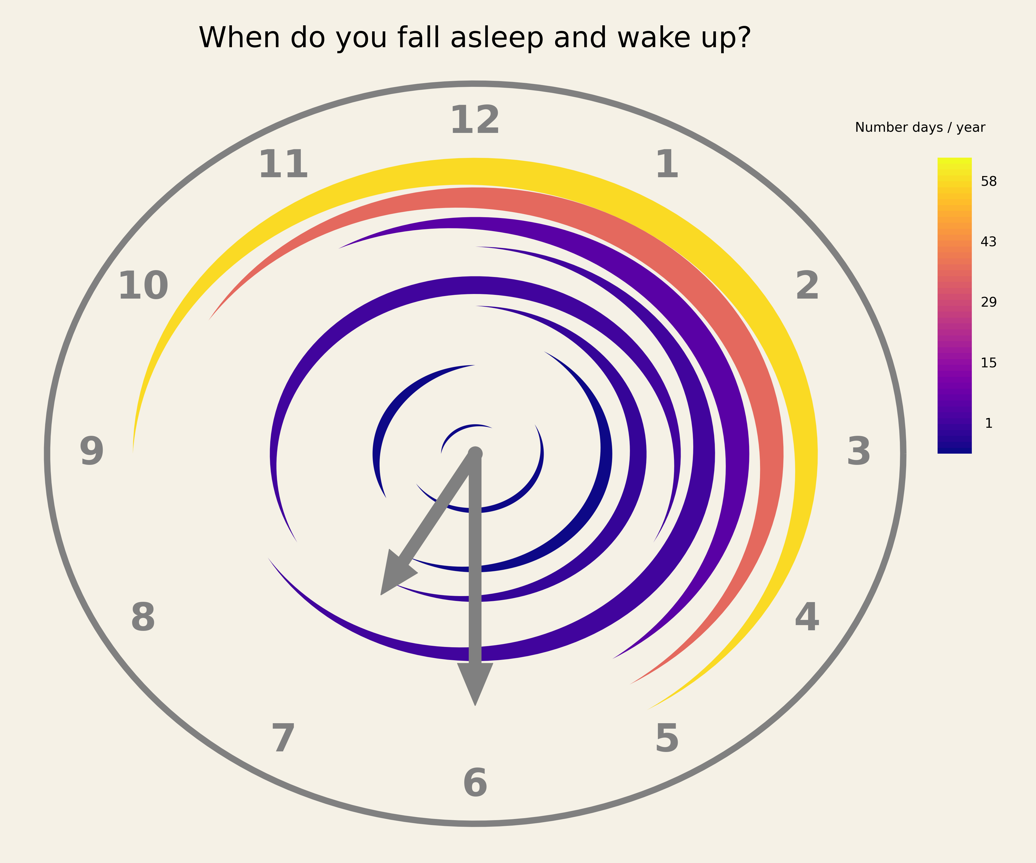
A clockplot is not a standard kind of plot.
Yuki Kakegawa’s Baseball Plots
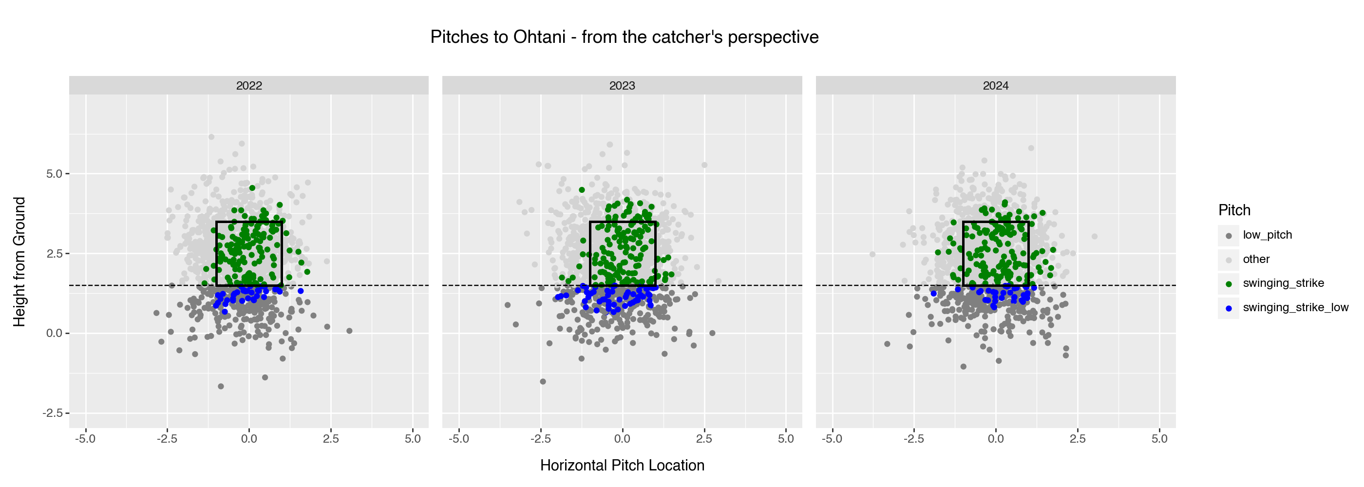
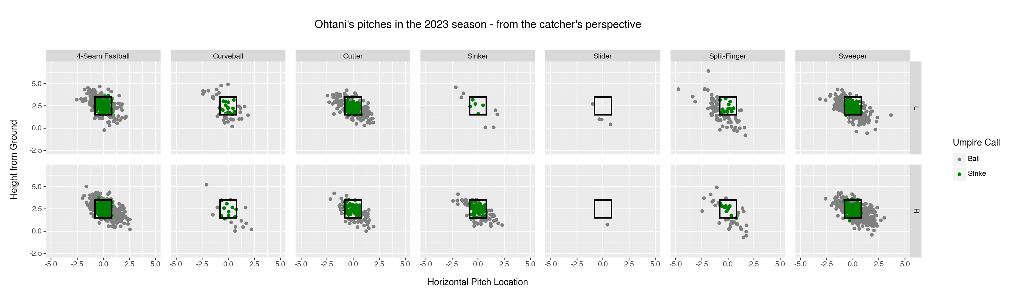
Each submission looks basic, and for a contest, easy to ignore. But looking closer and together, they tell a story of the submitter trying to come up with sets of plots for domain-specific graphical analysis. This is a high ideal as it is hard to come up with the sets of pictures that will, whenever used, easily and at a glance reliably tell the story worth one thousand words. We are glad that Yuki shared his trials.
For the Gallery
We asked the judges to note whether each submission they evaluated was interesting enough and unique enough if added to the plotnine gallery. For the submissions below, they said yes.
- Weather Forecast Plot - View the Code. By John T GitHub
- Coal Production Since 1900: Annotated Area Charts with plotnine - View the Code. By Nicola Rennie Website
- Dimensionality Reduction, Animated - View the Code. By Jeroen Janssens Website
- Creating a Plotnine Mondrian - View the Code. By Daniel Tan Website
- Advanced Multi Axis Spider Chart - View the Code . By Zvonimir Boban GitHub
- Clockplot: visualizing sleep data around the clock! - View the Code. By Marco Dalla Vecchia GitHub, Valeria Fonseca Diaz GitHub
- Entering the Golden Age of U.S. Women’s Soccer - View the Code. By Timothy A. Model GitHub
- Plotnine Chronicles: Artistic Heatmaps - Where Pixels Play! - View the Code. By Jaspreet Singh Pabla GitHub
- Plotnine Chronicles: Tetris Tactics - Where Pixels Play! - View the Code. By Jaspreet Singh Pabla GitHub
- 3T$ market cap milestone - View the Code. By Diego Garcia Lozano GitHub
- 🎨 Data Symphony: Vitruvian Data Visualization - View the Code. By Jaspreet Singh Pabla GitHub
- Reproducing Rise of AI over 8 decades plot {plotnine} vs {ggplot2} - View the Code. By Greg Chism GitHub
- Rise of Horror Movies - View the Code. By Deepali Kank GitHub
- Creating a Lollipop Plot with plotnine - View the Code. By Alier Reng GitHub
- Seeing Beyond Statistics: Anscombe’s Quartet and the Power of Graphs - View the Code. By Jeroen Janssens GitHub
- Gas Well Forecast: Decline Curve and Production Rate - View the Code. By Jeff Craggy GitHub
In Closing
It is incredibly hard to judge submissions with such a high level of quality & novelty. We fully acknowledge that there are many other great plotnine plot entries that we did not get to highlight in this article. You can check out all the submissions on the plotnine discussions page.
As mentioned above and in our original announcement, one big motivation to run this community event was to attract interest from plotnine users to help us develop the plotnine gallery. We were so happy to see so many well-documented examples; we’ll be inviting the folks above to contribute their entries there soon. We hope to see you share your work with the broader scientific community.
In this post, “I” is the voice of Hassan Kibirige, and “we” is the voice that includes the co-organisers of the contest, Curtis Kephart and Michael Chow (who is also helpful around other things plotnine). We are all grateful.
Plotnine and Posit, PBC
The development of plotnine is now sponsored by Posit, PBC and that has made this competition possible. As a member of the Open Source Team at Posit, I feel deeply committed to advancing the tools that data scientists use to make sense of their data, and to present and publish their work.

Hassan Kibirige
Related Content

What makes Posit different from proprietary analytics vendors

The Test Set 1 Year
