Everything new that's in {gt} 0.11.0


It has been quite a trip for the gt package. We are at version 0.11.0 now and the package still has the power to surprise! There are a ton of great new features and enhancements in this the latest version, and we’ll learn about the best new things in this blog post. The overall goal of the package is to make you a superstar when it comes to building beautiful, informative, information-packed tabulations (this is our mission statement).
Heading toward an eventual v1.0 release, our focus has been shifting to less in the way of massive new features and, instead, to long-overdue refinements and enhancements of the existing functionalities. This release has many such refinements but also some new features that we just couldn’t pass up:
- gt tables as grid tables
- Six new datasets
- LaTeX formula support in HTML output tables
- Better styling/layout support for LaTeX output tables
- Four new formatting functions, including support for chemical formulas/reactions
A huge amount of time and care has gone into bug fixes, code refactoring, error handling, additional testing, and other maintenance activities. The driving force behind so much of this is our longtime contributor Olivier Roy (@olivroy). Through dozens of PRs, many detailed write-ups, and presumably several full workdays, the extent of his valuable contributions cannot be understated. Thank you, Olivier!
Now let’s dive into everything new that’s in version 0.11.0 of gt!
gt tables as grid tables
What is grid? And what does it have to do with gt? The grid graphics system is part of what powers ggplot and helps make possible really beautiful plots in R. Tables and plots often go well together, but the different rendering approaches (and resultant output types) of ggplot and gt have previously made this heavily sought-after combining quite difficult.
Thanks to the work done by Teun van den Brand (@teunbrand), we now have a function for rendering a table as grid graphics: as_gtable(). With some additional help from the brilliant patchwork package, we can easily combine plots and tables. Let’s first make a summary table based on the venerable pizzaplace dataset:
pizza_gtable <-
    pizzaplace |>
    dplyr::filter(type %in% c("chicken", "supreme")) |>
    dplyr::group_by(type, size) |>
    dplyr::summarize(
        sold = dplyr::n(),
        income = sum(price),
        .groups = "drop"
    ) |>
    gt(
        rowname_col = "size",
        groupname_col = "type",
        row_group_as_column = TRUE
    ) |>
    tab_header(title = "Pizza Sales in 2015") |>
    fmt_integer(columns = sold) |>
    fmt_currency(columns = income) |>
    summary_rows(
        fns = list(label = "All Sizes", fn = "sum"),
        side = c("top"),
        fmt = list(
            ~ fmt_integer(., columns = sold),
            ~ fmt_currency(., columns = income)
        )
    ) |>
    grand_summary_rows(
        columns = c("sold", "income"),
        fns = Sum ~ sum(.),
        fmt = list(
            ~ fmt_integer(., columns = sold),
            ~ fmt_currency(., columns = income)
        )
    ) |>
    tab_options(summary_row.background.color = "gray98") |>
    tab_stub_indent(
        rows = everything(),
        indent = 2
    ) |>
    as_gtable()
Now, let’s make a ggplot pizza plot:
pizza_plot <-
    pizzaplace |>
    dplyr::mutate(date = as.Date(date)) |>
    dplyr::filter(type %in% c("chicken", "supreme")) |>
    dplyr::group_by(date, type) |>
    dplyr::summarize(
        sold = dplyr::n(),
        .groups = "drop"
    ) |>
    ggplot() +
    geom_line(aes(x = date, y = sold, color = type, group = type)) +
    facet_wrap(~type, nrow = 2) +
    scale_x_date(date_labels = "%b", breaks = "1 month") +
    theme_minimal() +
    theme(legend.position = "none") +
    labs(x = "", y = "Pizzas Sold")
With patchwork loaded, we can combine the plot and the table like this:
pizza_plot + pizza_gtable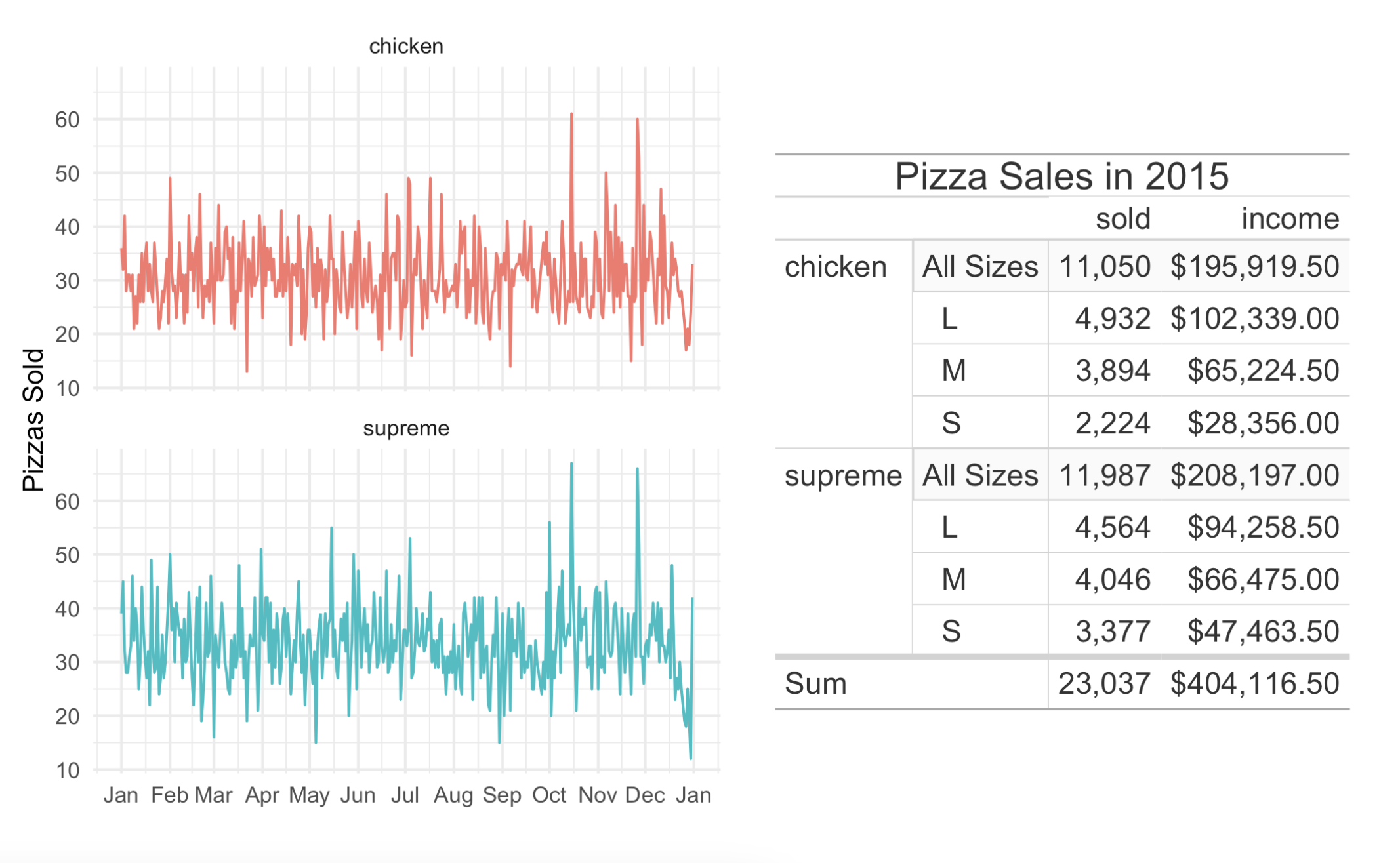
This is a great new feature and we hope you get a lot of value out of it!
New datasets
Datasets are great. We can’t get enough of them. Owing to this, we went ahead and added six more datasets to the package (bringing the total number to 18). The new datasets are:
peeps: A table of personal information for people all over the worldfilms: Feature films in competition at the Cannes Film Festivalgibraltar: Weather conditions in Gibraltar, May 2023reactions: Reaction rates for gas-phase atmospheric reactions of organic compoundsphotolysis: Data on photolysis rates for gas-phase organic compoundsnuclides: Nuclide data

Why do we keep adding datasets? Well, they’re great for examples! This new version of gt has a lot more examples per function within the docs. We find that an abundance of examples is both instructive and inspirational, so we’ll keep on adding them.
Oh, and the metro dataset (available since v0.9.0: March 31, 2023) has been updated as well. The reason? Six new Line 11 stations opened on June 13, 2024 so we quickly ensured those were added to this wondrous dataset.
LaTeX formula support in HTML, and it’s good!
Some people want to include math in their HTML tables and that’s fair. Now, when you have LaTeX math, we can use fmt_markdown() (for math in the table body) or md() (for math in new labels outside the table body) and we’ll get dependency-free and nicely-typeset math in the output table. You can either set the math within "$" (for inline mode) or "$$" (for display mode).
Here’s an example where mathematical formulas are present within the table body and also within the column labels:
dplyr::tibble(
  idx = 1:5,
  l_time_domain =
    c(
      "$$1$$",
      "$${{\\bf{e}}^{a\\,t}}$$",
      "$${t^n},\\,\\,\\,\\,\\,n = 1,2,3, \\ldots$$",
      "$${t^p}, p > -1$$",
      "$$\\sqrt t$$"
    ),
  l_laplace_s_domain =
    c(
      "$$\\frac{1}{s}$$",
      "$$\\frac{1}{{s - a}}$$",
      "$$\\frac{{n!}}{{{s^{n + 1}}}}$$",
      "$$\\frac{{\\Gamma \\left( {p + 1} \\right)}}{{{s^{p + 1}}}}$$",
      "$$\\frac{{\\sqrt \\pi }}{{2{s^{\\frac{3}{2}}}}}$$"
    )
) |>
  gt(rowname_col = "idx") |>
  fmt_markdown() |>
  cols_label(
    l_time_domain = md(
      "Time Domain<br/>$\\small{f\\left( t \\right) =
      {\\mathcal{L}^{\\,\\, - 1}}\\left\\{ {F\\left( s \\right)} \\right\\}}$"
    ),
    l_laplace_s_domain = md(
      "$s$ Domain<br/>$\\small{F\\left( s \\right) =
      \\mathcal{L}\\left\\{ {f\\left( t \\right)} \\right\\}}$"
    )
  ) |>
  cols_align(align = "center") |>
  opt_horizontal_padding(scale = 3)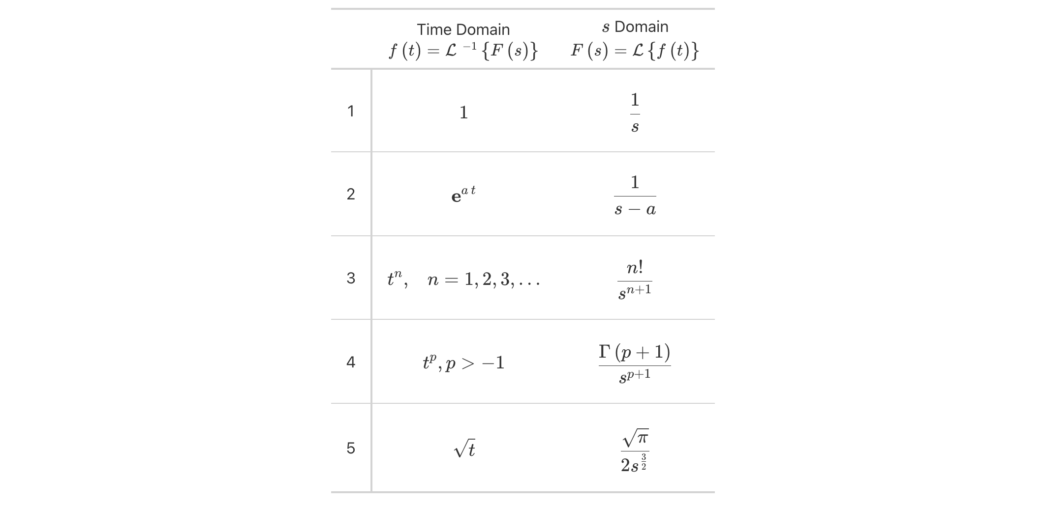
Laplace transforms have always been nicely presented as tabulations and now they can be beautifully rendered inside of HTML tables made with gt.
LaTeX tables are so much better now
For users producing LaTeX output tables, there is good news in gt v0.11.0: there is much better support for structuring and styling (closer to what’s available in HTML output tables), and a plethora of bugs where addressed. Virtually all of this work was expertly performed by Ken Brevoort (@kbrevoort), and we certainly appreciate the time and effort put into it.
Here’s an example of a simple LaTeX table render that uses styling that was otherwise not rendered in previous versions of gt.
towny |>
  dplyr::filter(csd_type == "city") |>
  dplyr::select(
    name, land_area_km2, density_2016, density_2021,
    population_2016, population_2021
  ) |>
  dplyr::slice_max(population_2021, n = 5) |>
  gt(rowname_col = "name") |>
  tab_header(
    title = md("Largest Five Places in `towny`"),
    subtitle = "Changes in vital numbers from 2016 to 2021."
  ) |>
  fmt_number(
    columns = starts_with("population"),
    n_sigfig = 3,
    suffixing = TRUE
  ) |>
  fmt_integer(columns = starts_with("density")) |>
  fmt_number(columns = land_area_km2, decimals = 1) |>
  cols_merge(
    columns = starts_with("density"),
    pattern = paste("{1};  {2}")
  ) |>
  cols_merge(
    columns = starts_with("population"),
    pattern = paste("{1};  {2}")
  ) |>
  cols_label(
    land_area_km2 = md("Area, km^2^"),
    starts_with("density") ~ md("Density, ppl/km^2^"),
    starts_with("population") ~ "Population"
  ) |>
  cols_align(align = "center", columns = -name) |>
  cols_width(everything() ~ px(150)) |>
  tab_style(
    style = cell_fill(color = "gray95"),
    locations = cells_body(columns = land_area_km2)
  ) |>
  tab_style(
    style = cell_fill(color = "lightblue" |> adjust_luminance(steps = 2)),
    locations = cells_body(columns = -land_area_km2)
  ) |>
  tab_style(
    style = cell_text(weight = "bold", transform = "uppercase"),
    locations = cells_stub()
  )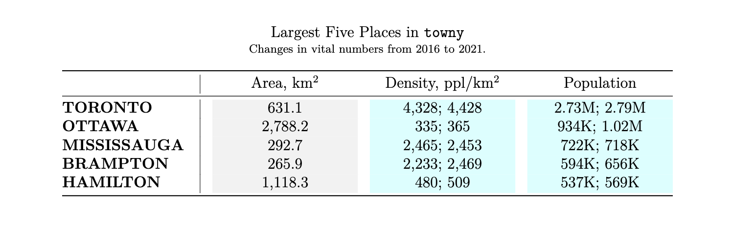
So, for those users that were less impressed by what LaTeX output could do… try it out now! And certainly, feel free to file an issue for anything that could be further improved.
New formatting functions
One thing gt has a lot of is formatting functions. These are functions of the form fmt_*(), and they give you a lot of power to transform inputs in cells into all sorts of useful representations. There are four new formatters in gt v0.11.0:
fmt_chem(): format chemical formulas or chemical reactionsfmt_email(): format email addresses to generate ‘mailto:’ linksfmt_country(): generate country names from their corresponding country codesfmt_tf(): formatTRUEandFALSEvalues
Let’s look at several examples to see how these formatting functions work in practice.
fmt_chem()
The new fmt_chem() function makes it easy to format chemical formulas or even chemical reactions in the table body. You might have single compounds that need formatting (e.g., "C2H4O", for acetaldehyde), or, there could be a need to format chemical reactions (e.g., "2CH3OH -> CH3OCH3 + H2O"). There’s a lot that fmt_chem() does to make chemistry look its best in a table! Here’s an example using the new photolysis dataset:
photolysis |>
    dplyr::filter(cmpd_name %in% c(
        "hydrogen peroxide", "nitrogen dioxide",
        "nitric acid", "acetaldehyde", "methyl peroxide",
        "methyl ethyl ketone", "methacrolein", "methyl vinyl ketone",
        "n-butyraldehyde", "i-butyraldehyde"
  )) |>
  dplyr::mutate(reaction = paste(cmpd_formula, products)) |>
  dplyr::select(cmpd_name, reaction, quantum_yield) |>
  gt() |>
  tab_header(title = "Photolysis pathways of selected VOCs") |>
  fmt_chem(columns = reaction) |>
  cols_label(
    cmpd_name = "VOC",
    reaction = "Photolysis Pathway",
    quantum_yield = "Quantum Yield, {{:Phi:}}"
  ) |>
  opt_align_table_header(align = "left") |>
  sub_missing(missing_text = "unknown") |>
  tab_source_note(
    source_note = md(
        "Quantum yield is defined as:
        $\\Phi = {\\frac {\\rm {\\#\\ molecules\\ decomposed}}
        {\\rm {\\#\\ photons\\ absorbed}}}$"
    )
  )
The upgrades to chemistry notation in gt allow for beautiful tables with chemical data formatted to the conventions of the field. And there is much more beyond this, including:
expression of charges with terminating
"+"or"-"characters (e.g.,"H+","[AgCl2]-","Y^{99+}", etc.)use of stoichiometric values (e.g.,
"2H2O2","1/2 H2O", etc.)styling to fit conventions (e.g.,
"NO_x","x Na(NH4)HPO4","*n*-C5H12", etc.)formatting of chemical isotopes like this:
"^{227}_{90}Th","^{0}_{-1}n^{-}", and"^0_-1n-"a variety of reaction arrows: (1)
"A -> B", (2)"A <- B", (3)"A <-> B", (4)"A <--> B", (5)"A <=> B", (6)"A <=>> B", or (7)"A <<=> B"center dots for addition compounds can be added by using a single
"."or"*"as in"KCr(SO4)2 . 12 H2O"or"KCr(SO4)2 * 12 H2O"single and double bonds with
"-"or"="between adjacent characters; two examples:"C6H5-CHO"and"CH3CH=CH2"inclusion of Greek letters by surrounding the letter name with colons; here’s an example that describes the delta value of carbon-13:
":delta: ^13C"
Here’s how that all looks in a reference table:
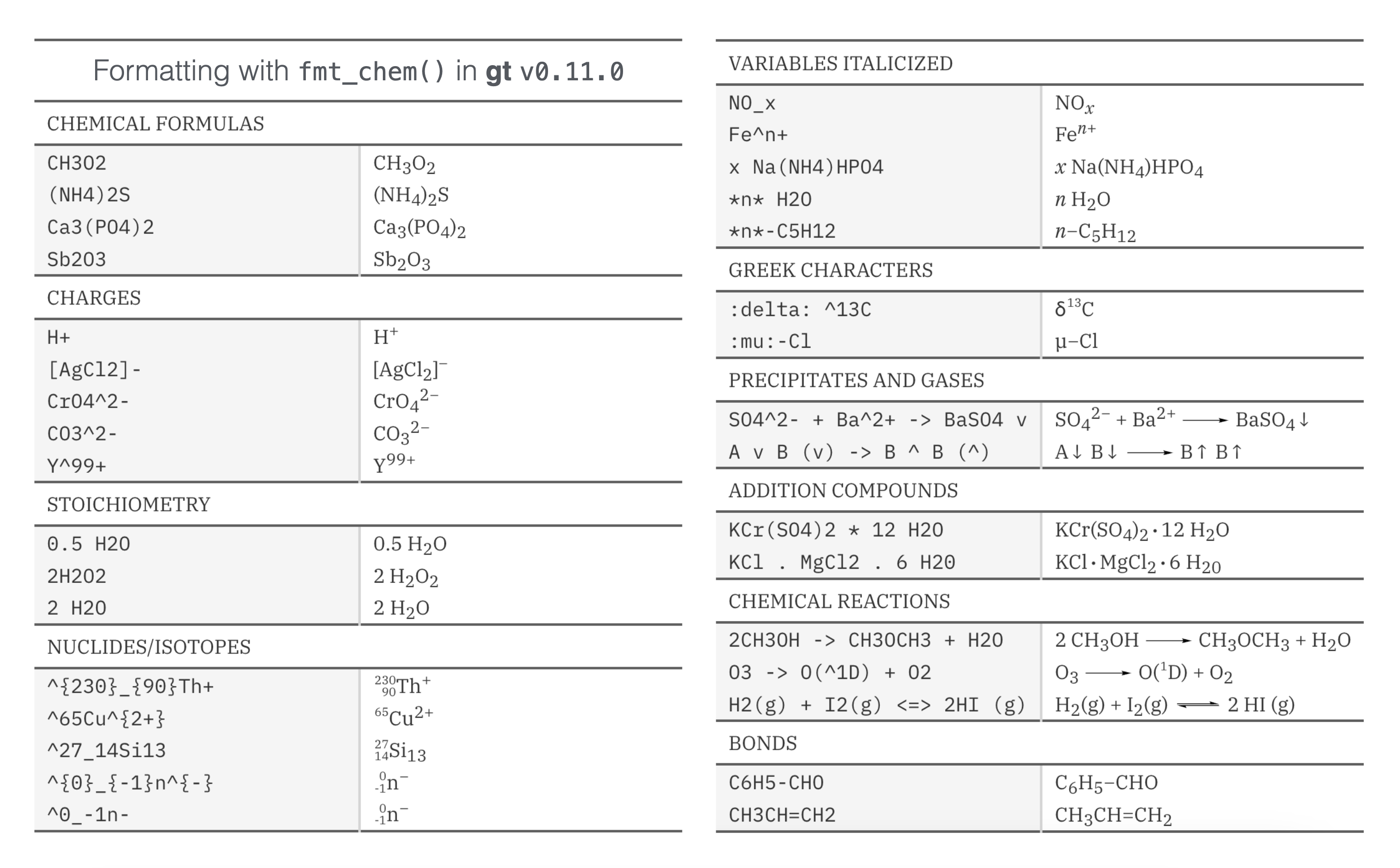
If you have a need to include chemistry in your gt table, please try out this new functionality!
fmt_email()
While fmt_url() is a suitable function for creating links from URLs, there wasn’t a comparable formatting function for handling email addresses. We added the fmt_email() function for this task and the rendered email addresses can now interact properly with email clients on the user system.
Let’s take ten rows from the peeps dataset and create a table of contact information with mailing addresses and email addresses. With the column that contains email addresses (email_addr), we can use fmt_email() to generate ‘mailto:’ links. Clicking any of these formatted email addresses should result in new message creation (though this can depend on the OS integration with an email client).
peeps |>
  dplyr::filter(country == "AUS") |>
  dplyr::select(
    starts_with("name"),
    address, city, state_prov, postcode, country, email_addr
  ) |>
  dplyr::mutate(city = toupper(city)) |>
  gt(rowname_col = "name_family") |>
  tab_header(title = "Our Contacts in Australia") |>
  tab_stubhead(label = "Name") |>
  fmt_email(columns = email_addr) |>
  fmt_country(columns = country) |>
  cols_merge(
    columns = c(address, city, state_prov, postcode, country),
    pattern = "{1}<br>{2} {3} {4}<br>{5}"
  ) |>
  cols_merge(
    columns = c(name_family, name_given),
    pattern = "{1},<br>{2}"
  ) |>
  cols_label(
    address = "Mailing Address",
    email_addr = "Email"
  ) |>
  tab_style(
    style = cell_text(size = "x-small"),
    locations = cells_body(columns = address)
  ) |>
opt_align_table_header(align = "left")| Our Contacts in Australia | ||
| Name | Mailing Address | |
|---|---|---|
| Christison, Milla |
34 McGregor Street KINALUNG NSW 2880 Australia |
milla_c@example.com |
| Stead, Alannah |
44 Mt Berryman Road ROPELEY QLD 4343 Australia |
alannahstead@example.com |
| Fitzhardinge, Lucas |
88 Dossiter Street WATERLOO TAS 7109 Australia |
lucas_fitz@example.com |
| Goldhar, Lucinda |
24 Settlement Road DARGO VIC 3862 Australia |
lucinda_g@example.com |
| Dearth, Alexis |
60 Sunnyside Road TAYLORVILLE SA 5330 Australia |
alexisdearth@example.com |
| Hansen, Christopher |
99 Weemala Avenue GOOLOOGONG NSW 2805 Australia |
chrishansen85@example.com |
| Kaczmarek, Scott |
94 Peninsula Drive ILLAWONG NSW 2234 Australia |
scott_kaczmarek@example.com |
| Pugliesi, Brandon |
83 McDowall Street BALMORAL RIDGE QLD 4552 Australia |
brandon_pugliesi@example.com |
| Bremer, Rachel |
80 Argyle Street STRATFORD NSW 2422 Australia |
rachel_bremer@example.com |
| Kerferd, Kaitlyn |
15 Souttar Terrace KINGSLEY WA 6026 Australia |
kaitlyn_kerferd@example.com |
There are also many possibilities for further display customization like displaying the names of the email recipients instead of the email addresses (by using the from_column() helper in the display_name argument). Check out the documentation in ?fmt_email for many such examples!
fmt_country()
Tables that have data split across countries often need to have the country name included. While this seems like a fairly simple task, it really is not. Being consistent with country names can be fraught with difficulty.
This is where fmt_country() comes in. This new formatting function will supply a well-crafted country name based on a 2- or 3-letter ISO 3166-1 country code in the input. The resulting country names have been obtained from the Unicode CLDR, which is a good source since all country names are agreed upon by consensus. Furthermore, the country names can be localized/translated to any of 574 different locales via the function’s locale argument.
Let’s look at an example that uses the new films dataset. Here, fmt_country() resolves country codes in the countries_of_origin column and the function can handle multiple country codes per cell so long as they’re delimited by commas (as they are here).
films |>
  dplyr::filter(year == 1959) |>
  dplyr::select(
    title, run_time, director, countries_of_origin, imdb_url
  ) |>
  gt() |>
  tab_header(title = "Feature Films in Competition at the 1959 Festival") |>
  fmt_country(columns = countries_of_origin, sep = ", ") |>
  fmt_url(
    columns = imdb_url,
    label = fontawesome::fa("imdb", fill = "black")
  ) |>
  cols_merge(
    columns = c(title, imdb_url),
    pattern = "{1} {2}"
  ) |>
  cols_label(
    title = "Film",
    run_time = "Length",
    director = "Director",
    countries_of_origin = "Country"
  ) |>
  opt_vertical_padding(scale = 0.5) |>
  opt_horizontal_padding(scale = 2.5) |>
  opt_table_font(stack = "classical-humanist", weight = "bold") |>
  opt_stylize(style = 1, color = "gray") |>
tab_options(heading.title.font.size = px(26))The fmt_country() function is super powerful and can even resolve countries that no longer exist! Historical country codes like "SU" (‘USSR’), "CS" (‘Czechoslovakia’), and "YU" (‘Yugoslavia’) are resolved, which is a nice touch.
fmt_tf()
It completely escaped us that tables may contain TRUE/FALSE values (i.e., logical values) that are in need of formatting. That situation is remedied in v0.11.0 of gt with the new fmt_tf() function. With this formatter we let you resolve logicals to a number of preset (yet customizable) combinations of words or symbols.
Let’s have a look at two examples. The first is of a table of small towny towns/villages/hamlets. There are two TRUE/FALSE columns: (1) does this tiny place have a website? and (2) has the population increased? Each of these fmt_tf() calls will either produce "yes"/"no" or "up"/"down" strings (set via the tf_style option).
towny |>
  dplyr::arrange(population_2021) |>
  dplyr::mutate(website = !is.na(website))  |>
  dplyr::mutate(pop_dir = population_2021 > population_1996) |>
  dplyr::select(name, website, population_1996, population_2021, pop_dir) |>
  dplyr::slice_head(n = 10) |>
  gt(rowname_col = "name") |>
  tab_spanner(
    label = "Population",
    columns = starts_with("pop")
  ) |>
  tab_stubhead(label = "Town") |>
  fmt_tf(
    columns = website,
    tf_style = "yes-no",
    auto_align = FALSE
  ) |>
  fmt_tf(
    columns = pop_dir,
    tf_style = "up-down",
    pattern = "It's {x}."
  ) |>
  cols_label_with(
    columns = starts_with("population"),
    fn = function(x) sub("population_", "", x)
  ) |>
  cols_label(
    website = md("Has a  \n website?"),
    pop_dir = "Pop. direction?"
  ) |>
opt_horizontal_padding(scale = 2)| Town | Has a website? |
Population
|
||
|---|---|---|---|---|
| 1996 | 2021 | Pop. direction? | ||
| Cockburn Island | yes | 2 | 16 | It's up. |
| Thornloe | no | 132 | 92 | It's down. |
| Brethour | no | 181 | 105 | It's down. |
| Gauthier | no | 152 | 151 | It's down. |
| Mattawan | yes | 115 | 153 | It's up. |
| Hilton Beach | yes | 213 | 198 | It's down. |
| Opasatika | yes | 349 | 200 | It's down. |
| Hilliard | yes | 253 | 215 | It's down. |
| Pelee | yes | 283 | 230 | It's down. |
| Head, Clara and Maria | yes | 294 | 267 | It's down. |
Like the fmt_country() function (and many others previously added), fmt_tf() has a locale argument for localizing any word-based formatting outputs to a wide range of languages.
Here’s another example, this time using up and down arrow icons. The premise is that a logical value could denote whether something increased or decreased. In the case of this sp500 data, it’ll be shown whether the daily close price was higher than the open price. We can even assign colors to the arrows through the colors argument (super useful).
sp500 |>
  dplyr::filter(date >= "2013-01-07" & date <= "2013-01-12") |>
  dplyr::arrange(date) |>
  dplyr::select(-c(adj_close, volume, high, low)) |>
  gt(rowname_col = "date") |>
  cols_add(dir = close > open, .after = open) |>
  fmt_tf(
    columns = dir,
    tf_style = "arrows",
    colors = c("green", "red")
  ) |>
  fmt_currency(columns = c(open, close)) |>
  cols_label(
    open = "Opening",
    close = "Closing",
    dir = ""
)| Opening | Closing | ||
|---|---|---|---|
| 2013-01-07 | $1,466.47 | ↓ | $1,461.89 |
| 2013-01-08 | $1,461.89 | ↓ | $1,457.15 |
| 2013-01-09 | $1,457.15 | ↑ | $1,461.02 |
| 2013-01-10 | $1,461.02 | ↑ | $1,472.12 |
| 2013-01-11 | $1,472.12 | ↓ | $1,472.05 |
This type of formatting can help provide quicker insights into the data and we’re hoping you’ll find it useful for some of your table-making tasks.
In closing
There’s so much great new stuff in gt so try out v0.11.0 and let us know what you think! Talk with us by filing an issue, or ask us anything in the GitHub Discussions.
You can keep up with us by following the engaging @gt_package account on X/Twitter! There’s also a Discord server, and we do like to talk tables there, so join us!

Rich Iannone
Related Content

Deploying boosted tree models with Orbital

Building realistic fake datasets with Pointblank
