Cancer InFocus: Communicating catchment area insights with cancer data science

In the mid-2010s, the National Cancer Institute (NCI) began requiring every NCI-Designated Cancer Center to define a geographic “catchment area” to serve as the primary focus of their research and outreach. That came with a practical expectation: cancer centers should be able to describe the cancer burden of their catchment area—clearly, completely, and in a way that’s easy to share with leaders, researchers, and the community.
Several centers responded by building public-facing dashboards.
In 2021, our team at the University of Kentucky Markey Cancer Center Community Impact Office started planning a dashboard of our own. Looking around, we noticed a pattern: many centers were investing heavily in a one-off, custom web application that was expensive to build, hard to maintain, and difficult to adapt over time.
We took a different route.
Instead of building one dashboard for one center, we built a set of dashboards that many centers could adopt at minimal cost using tools that cancer center analysts already know: R and Shiny. Not just that, but we also wrote scripts to gather the data needed to populate the dashboards. The resulting project, which we named Cancer InFocus, was completed and launched publicly in summer 2022.
Cancer InFocus in a nutshell
Cancer InFocus is an end-to-end cancer surveillance dashboard solution:
- Python scripts gather and assemble publicly available data. Up-to-date data for every NCI-Designated Cancer Center catchment area and every US state is published monthly on CancerInFocus.org.
- R + Shiny power interactive dashboards for exploration, reporting, and (in some cases) analysis. This code is made available to institutions through a no-cost licensing agreement, so centers can adopt, adapt, and deploy the dashboards for their own catchment areas.
As of February 2026, Cancer InFocus has been licensed by 54 institutions, including over half of the NCI-Designated Cancer Centers and NCI’s own Center for Cancer Research.
Why R and Shiny made the difference
Many traditional dashboard efforts rely on custom JavaScript applications. Those apps can be great, but they typically require specialized engineering support that most cancer centers don’t have on staff. That often means contracting outside developers for the initial build and any future updates, fixes, or features.
R is different. It’s already widely used within cancer centers, where staff often come from epidemiology or biostatistics backgrounds. While they may not have previous experience with Shiny, they can usually learn the pieces they need—especially with shared patterns, documentation, and a support channel for troubleshooting.
A simple workflow to ease adoption
Cancer InFocus is designed from the ground up for efficiency and reproducibility. In fact, going from nothing to a deployed dashboard can be easily done within an hour by following a few simple steps:
1) Clone the current scripts from the Cancer InFocus GitHub repo
Once a center has completed the no-cost licensing agreement for Cancer InFocus, they are granted access to the Cancer InFocus GitHub repo, where all necessary files are stored in a single, version-controlled folder.
2) Run the global pre-processing script
Among the files in the cloned folder is a global pre-processing script. Users are directed to change a couple of environment variables to identify their cancer center and the dashboards they wish to build, and then run this script. The pre-processing will then:
- Make sure the user has all necessary packages installed and set to the appropriate version.
- Set up the correct folder architecture for the desired dashboards and copy the dashboard scripts to them.
- Pull the data for the desired cancer center catchment area.
- Prepare the county- and census tract-level data (along with associated spatial files) and copy them to the appropriate dashboard folders.
- Prepare data on facilities and health care providers, geolocating any items that don’t already contain latitude and longitude information, and copy them to the appropriate dashboard folders.
Part of preparing the county- and census-tract-level data involves converting everything into tidy datasets. Using tidy principles for data prep means the dashboards can populate filters directly from the data, avoiding the need to hard-code lists of categories or measures inside the dashboard scripts. This also means centers can easily add their own locally maintained data. As long as it follows the same structure as the included data, it will show up in the dashboards without changing any dashboard code.
3) Build and deploy dashboards
Cancer InFocus currently includes four dashboards, plus a flexdashboard that helps bundle them into a single unified product. For each dashboard, centers only need to edit a small set of configuration values at the top of the script—things like catchment area identifiers and file paths—and then run and deploy the dashboard to the hosting solution of their choosing.
What’s included: four dashboards, four ways to explore
Each of the four Cancer InFocus dashboards provides a unique perspective on the data, built off the same core ideas of efficiency and reproducibility.
- CIF Main—Mapping one variable across the catchment area
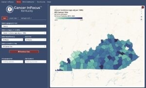
The original Cancer InFocus dashboard (“CIF Main”) is a univariate choropleth map built with mapgl. On this dashboard, users choose a geographic level, category of variables, and specific indicator of interest using pickers from shinyWidgets. With each selection, the map instantly updates. If they need a figure of the chosen indicator for a grant, slide deck, or report, they can use the built-in map download button to generate and download a PNG output.
- CIF²—Exploring relationships between two measures
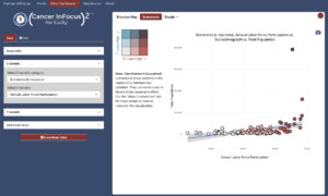
While the main dashboard is restricted to a single indicator, “CIF²” lets users select two measures and visualize their relationship as either a bivariate map (using mapgl) or a scatter plot (using plotly). This can help in uncovering patterns both overall and within the geographic area of interest.
- CIF Profiles—Focusing on a specific county
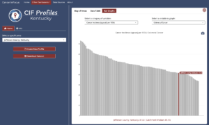
“CIF Profiles” flips the typical interaction between indicators and geography. Instead of starting with a single variable, users start with a place—selecting one or more counties in the catchment area—and then exploring all of the available data. This data can be reviewed in an interactive table (making use of the DT package) or exported to a PDF report generated by an R Markdown template.
- CIF Hot Spots—Moving from description to analysis
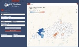
Our newest dashboard, “CIF Hot Spots,” is where we move from describing patterns to estimating them. Here, users select a geography, category, and indicator just like in CIF Main. However, clicking the Calculate Hot Spots button runs a cluster analysis (e.g., Getis-Ord Gi*, Local Indicators of Spatial Association) and maps the results.
What we’ve learned
Cancer centers need tools that are accurate, shareable, and sustainable. For us, R and Shiny made it possible to build a system that’s:
- easier for centers to adopt and maintain with existing staff skills
- flexible enough to incorporate local data
- aligned with the workflows analysts already use for research and reporting
Based on our research among early adopters, Cancer InFocus has reduced the time, effort, and cost required to share catchment area data—and helped centers redirect resources toward other parts of their mission.
Where we’re going
Though Cancer InFocus was originally designed for use by cancer centers, it is also an ideal tool for central cancer registries, cancer-focused non-profits, or any other organization needing place-based cancer data within the US. Over time, we hope to also expand out to serving public health surveillance needs more broadly, with included datasets covering additional disease fields or health concerns such as diabetes, cardiovascular disease, or substance use disorders.
If you’d like to learn more about adopting Cancer InFocus or contributing to its development, feel free to reach out.

Todd Burus
Related Content

Score a Disease Surveillance Model Inside Snowflake, Without Moving

Governed AI for Public Health: Reading Free-Text Records with Snowflak...
