Scheduling a Quarto Doc on Posit Connect


About
This is part 6 in our series of blog posts, “What can you do with Posit Connect?”
Posit Connect is a publishing platform for the authenticated sharing of R and Python data products in one convenient place that brings the power of data science to your entire organization. On the last Wednesday of every month, we host a Posit Team demo and Q&A session that is open to all. You can use this link to add the event to your calendar.
To deliver valuable insights, you need a seamless way to get work off of your laptop and into the hands of business stakeholders. For some teams, these insights are delivered through redundant, manual reports. There’s a more efficient way to do this. We’ll show you how to deploy company branded reports and schedule updates to be emailed out to your business stakeholders every day so you can get time back in your day.
With Posit Connect, it’s easy to share reports with Quarto, R Markdown, Jupyter Notebooks, and more. You can also use Connect to deploy Shiny, Dash, Bokeh, Voilà, Streamlit applications, Quarto projects, dashboards, plots, Plumber and Flask APIs, and more in one convenient place to bring the power of data science to your entire organization.
This example will walk through publishing a Quarto doc with custom branding written on Posit Workbench to Posit Connect. Quarto is an open-source tool for technical publishing designed to help data scientists (using Python, R, Observable, Julia, etc.) share their analytic insights. It speeds up and simplifies the process of creating professional-quality presentations, reports, websites, and blogs in a variety of formats such as PDF, MS Word, HTML, and much more, all within the same environment used to create one’s analysis.
For more information on Quarto specifically, check out this recent blog post which highlights ways Quarto can help automate repetitive tasks and enable teams to spend less time tweaking the appearance of their output so they can focus more time on delivering outstanding work.
Follow-Along
Goal for our end-to-end workflow: Share insights on constantly updated data in a beautiful and automated report for stakeholders to access daily.
To review our end-to-end workflow:
- Gather data you will use (package download data from Posit Package Manager’s experimental API)
- Create Quarto Doc #1 (used to gather, process, and save your data)
- Publish Quarto Doc #1 to Posit Connect
- Schedule your Quarto Doc #1 on Posit Connect to refresh daily with latest data
- Pin the refreshed data to Posit Connect
- Create Quarto Doc #2 (your report for stakeholders)
- Apply a custom theme to this Quarto document to improve its appearance
- Publish and schedule this Quarto Doc #2 on Posit Connect
All of the source code for this example end-to-end workflow can be found on GitHub.
Step 1: Gather the data you will use for your report
For this example, we extracted R package download data from within Posit Package Manager using an experimental API from within Package Manager. This API can be used to gather useful information like package download metrics.
This is great for auditing purposes or for those curious about the popularity of certain packages from within your own instance of Posit Package Manager. Perhaps many of your colleagues are delivering valuable insights with a package you haven’t yet heard of.
For our data, we are using Posit’s Public Package Manager. This is a free, hosted service. In addition to providing standard mirrors of CRAN, Bioconductor, and PyPI, you can track changes over time or freeze packages to specific versions, to help ensure reproducibility and ease collaboration.
This instance of Package Manager is used by hundreds of data science teams throughout the world and will serve as a good proxy for understanding R package download trends.
Here’s some example data of what can be gleaned from the Package Manager API:
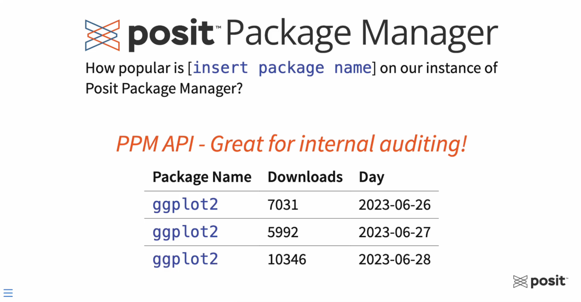
On the left hand, we can see the R Package Name — in this case ggplot2 (based on the grammar of graphics, the idea that you can build every graph from the same components: a data set, a coordinate system, and geoms) — then the number of downloads of this package on a specific day.
This data is constantly updating as people continue to download packages from Posit Package Manager. One of the goals for this workflow is to automate the data extraction and visualization steps so that our final reports will reflect the latest and greatest data - which brings us to Quarto.
For this workflow, we will create two Quarto documents: 1. One for gathering, processing, and saving our data. This is often referred to as an ETL (Extract, Transform, Load) process. 2. One for generating a report with tables and plots to visualize our results.
Step 2: Create the first Quarto document (ETL Process)
You can create Quarto documents (articles, reports, presentations, websites, blogs, books, etc.) in a variety of formats and in whatever environment is most comfortable for you - including VS Code, RStudio, JupyterLab, or any text editor. For this example, we will create our Quarto documents in the RStudio IDE on Posit Workbench.
Posit Workbench is the place for teams to collaboratively build open-source data science projects at scale. It supports R and Python, giving data scientists access to all the development environments they love, including RStudio, Jupyter Notebook, JupyterLab, and VS Code. Workbench provides enterprise-friendly features, such as centralized management, security, and commercial support. VS Code is a great all-purpose editor, and it is the IDE you will use today.
In Posit Workbench, open up a new RStudio session and create an RStudio project for the workflow.
In the top right corner, you can see Project: (None). Click that to select “New Project” - and you’ll have some options of where you want to place this Project. It can be in a new directory, an existing directory, or pulling a project from version control.
For this example, we’ll select “New Directory,” then “New Project,” give this directory a name, and finally select “Create Project.” Anytime you open up a new project, it will open up a new RStudio session.
Within your new RStudio project, the first step will be to create a blank Quarto file. Do this by clicking the “New Blank File” dropdown and selecting Quarto doc (shown in the video below).
With the help of the visual markdown editor, add your first component - a YAML - to the Quarto document. YAMLs are usually found at the very top of the Quarto documents and are used to provide metadata to our documents.
Add a YAML to your blank Quarto doc, by going to the “Insert” dropdown and selecting “YAML block.”
Give your document a title and author. It should look like this:
---
title: "Your Report Title"
author: "Your Name"
---
To check what this looks like initially, select the “Render” button, and by default, it’ll use HTML.
Next add some R code to your Quarto document. You do this by adding an R code chunk or a cell to your document. This can be found in the “Insert” dropdown menu.
Click “Insert code cell” and add an R code chunk. For this example the code we have copied and pasted will load a few packages for our workflow and is found below:
library(tidyverse) # Data science packages
library(httr)      # For API queries
library(jsonlite)  # Parsing JSON files
library(pins)      # Save data to Posit Connect as Pin
Next, add some text to your document that will provide the reader with background information regarding the ETL process within this Quarto doc.
This is the text from the demo report:
## Introduction

For this workflow, we'll query the API from within Posit's Public Package Manager using two custom R functions:

-   `get_package_count()`: Will extract the total number of downloads over the past N days (30 days by default), for a certain R package on [Posit's Public Package Manager](https://packagemanager.posit.co/client/#/).

-   `get_package_count_history()`: Will extract the total number of package downloads per day from a defined start date. You can provide more than one package name (as a vector).
Step 3: Publish the Quarto doc to Posit Connect
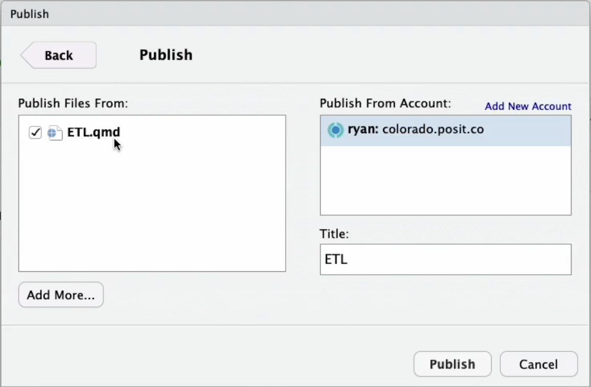
To publish the Quarto document, you’ll see a blue button at the top of your screen. This is the publishing button. Click on this and choose Posit Connect to publish this document with the source code, which is really important for job scheduling.
Publish the single ETL.qmd file, which is what you see on the left-hand side below:
[If this is your first time connecting your RStudio IDE to your Posit Connect instance and need help, you can view instructions for that here.]
During the publishing process, your environment is captured, including what R packages you use, what versions of those packages, what R version, what Quarto version, etc., and is sent to Posit Connect to replicate that environment and then deploys this Quarto document.
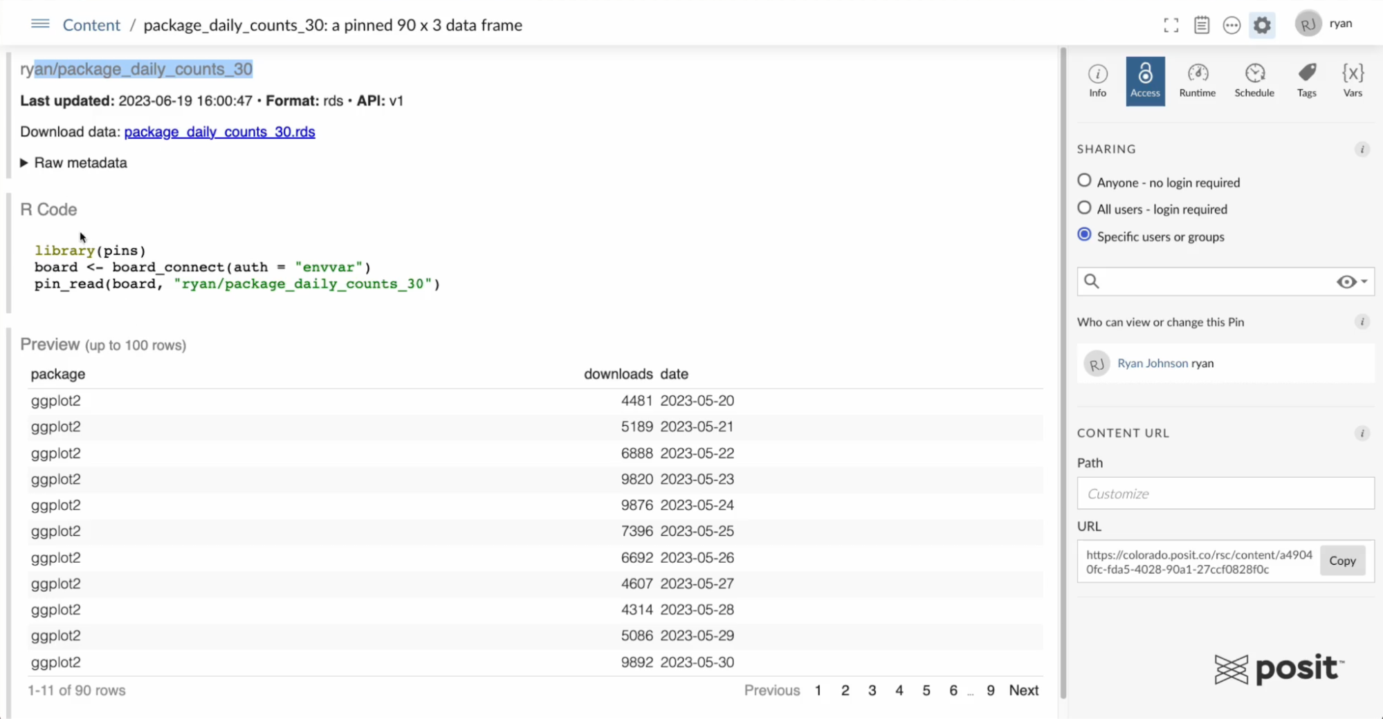
Step 4: Pin your results to Posit Connect
When data needs to be reused across multiple projects or pieces of content, it is best if that data is stored somewhere centrally accessible by multiple people where the latest version is always available. With the pins package, it’s easier than ever to have repeatable data.
Pins is an open-source package that allows you to publish and share R or Python objects (data, models, etc.) across projects and with your colleagues.
To use pins for this project, first register your pin board - which in this case is Posit Connect.
# Connect to Posit Connect
board <- board_connect()
The below code will take the two data frames package_counts_30 and package_daily_counts_30 and pin them to Posit Connect, making them accessible to other content.
# Write package_counts_30 to Posit Connect
pin_write(board, package_counts_30)

# Write package_daily_counts_30 to Posit Connect
pin_write(board, package_daily_counts_30)
This is an example below of the pinned datasets on Posit Connect. There is an R code snippet included in the pin that gives users instructions for how to read this pin into their own workflows.
Step 5: Schedule your ETL report to refresh daily
As a publisher, you have the ability to schedule code to run on a recurring schedule. The package download data for this example updates daily, so you could set this document to run every single morning at 7 AM (or whenever you wish) to keep it updated with the latest data.
To do this, click on the schedule tab in the right side options. Select the box to schedule output for default and choose the time that you want this to run. This way the pinned data sets will remain updated without any manual intervention.
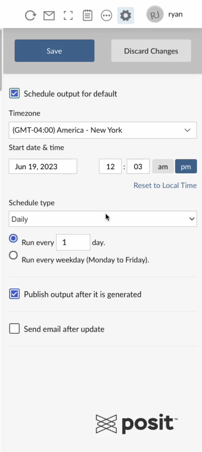
You’ll also see two boxes at the bottom. The first one means that the report you see on your left will be updated and republished every time the document runs. The second box is to send an email to users letting them know the document was rerun.
Step 6: Create your second Quarto document (Report for Stakeholders)
Go back into Posit Workbench and create another Quarto report. Select “New Blank File” and create a YAML just like we did before in Step 2.
Add a title and an author. Then, in a separate code cell, copy in some code to load the R packages.
library(tidyverse)
library(pins)
Add text to introduce your readers to the report and then include code to read in that pinned data from above. This example looks at the download data over the last 30 days to visualize trends.
When you viewed the pin above, it included an R code snippet to draw that data into your workflows.
# Connect to Posit Connect
board <- board_connect(auth = "envvar")

# Read pin (total downloads)
package_counts_30 <- pin_read(board, "ryan/package_counts_30")

# Read pin (download per day)
package_daily_counts_30 <- pin_read(board, "ryan/package_daily_counts_30")
Add two additional code chunks: 1. To print the raw data, which will be a data frame 2. Create a plot using the ggplot2 package
# Create gt table
package_counts_30
# Create plot
ggplot(package_daily_counts_30, aes(x = as_date(date), y = downloads, color = package)) +
geom_smooth(linewidth = 1.3)Render this report and you’ll see that our final HTML is very boring, but provides the information we need and you can see some of the trends of the package downloads over time.
Step 7: Add a custom theme to your Quarto doc
When sharing a report or any visualization with your colleagues or leadership, you can improve the appearance of your deliverable with custom branding.
For this example, go back into Posit Workbench and download the custom Posit format that Ryan Johnson created and made available on GitHub.
If you’re curious about how to create your own theme or template, the Quarto website has great documentation for this.
To use this Posit Quarto Theme, copy the below into your Terminal and hit Enter:
quarto use template rstudio/posit_themeFollow along with the instructions. IT will ask if you trust the author and to give the directory a name (in this case “posit-theme”). If you look in your files directory in the right-hand corner of the RStudio IDE, you will see the posit-theme folder.
This new directory includes a template quarto document, posit-theme.qmd and an example HTML output file, called template.html.
This is what the template document will look like:
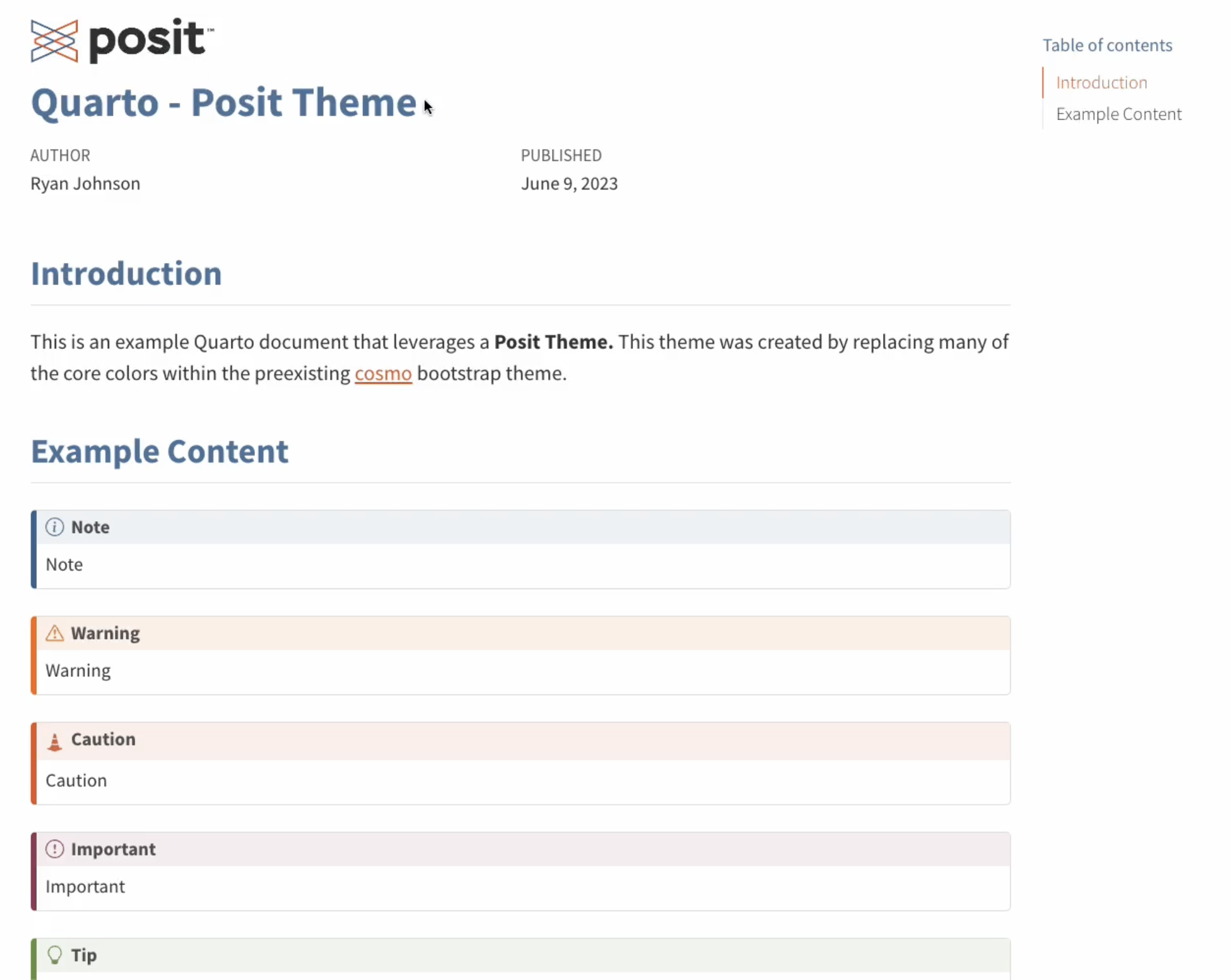
To use this template for your report, open up the “posit-theme.qmd” and delete the placeholder text. Come back to your initial “boring report” and copy the contents into your “posit-theme.qmd” report.
When you render this document, you will see that it’s starting to look a lot better. However, it includes a lot of code that your business stakeholders may not need to see.
There are some further opportunities to improve the look of this report as well. For example, the plot still uses the generic ggplot2 colors.
To improve the look of this Quarto document, you can add a custom color palette using a package called rcolorbrewer.
You’ll need to load that package into your environment and add your own color palette directly underneath.
# Install Packages
library(pins)
library(tidyverse)
library(RColorBrewer)
library(gt)
# Define Posit Color/Theme
posit_blue <- "#447099"
posit_orange <- "#EE6331"
posit_gray <- "#404041"
posit_teal <- "#419599"
posit_green <- "#72994E"
posit_burgundy <- "#9A4665"
posit_colors <- colorRampPalette(colors = c(posit_gray, posit_blue, posit_teal, posit_green,
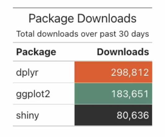
posit_burgundy, posit_orange))(6)To improve the printed raw data frame, convert the printed text output to a table and add some custom themed coloring. To do this, you will load and use a package called gt (for making wonderful-looking tables).
# Create gt table
package_counts_30 |>
dplyr::arrange(desc(Downloads)) |>
dplyr::select(Package, Downloads) |>
gt() |>
fmt_integer(Downloads) |>
cols_label(
Package = md("**Package**"),
Downloads = md("**Downloads**")
) |>
tab_header(
title = "Package Downloads",
subtitle = "Total downloads over past 30 days"
) |>
data_color(
columns = Downloads,
palette = posit_colors
)
To change the look of your ggplot, you will include a custom theme as well. You can also tweak the look by adding a minimal theme and customize the title and labels.
# Create plot
ggplot(package_daily_counts_30, aes(x = as_date(date), y = downloads, color = package)) +
geom_smooth(linewidth = 1.3) +
labs(
title = "Package Download Trends",
subtitle = "Past 30 days",
x = "",
y = "Daily Downloads",
color = "Package"
) +
scale_x_date(date_labels = "%b %Y") +
scale_y_continuous(labels = scales::label_number(big.mark = ",")) +
theme_minimal() +
scale_color_manual(values = posit_colors)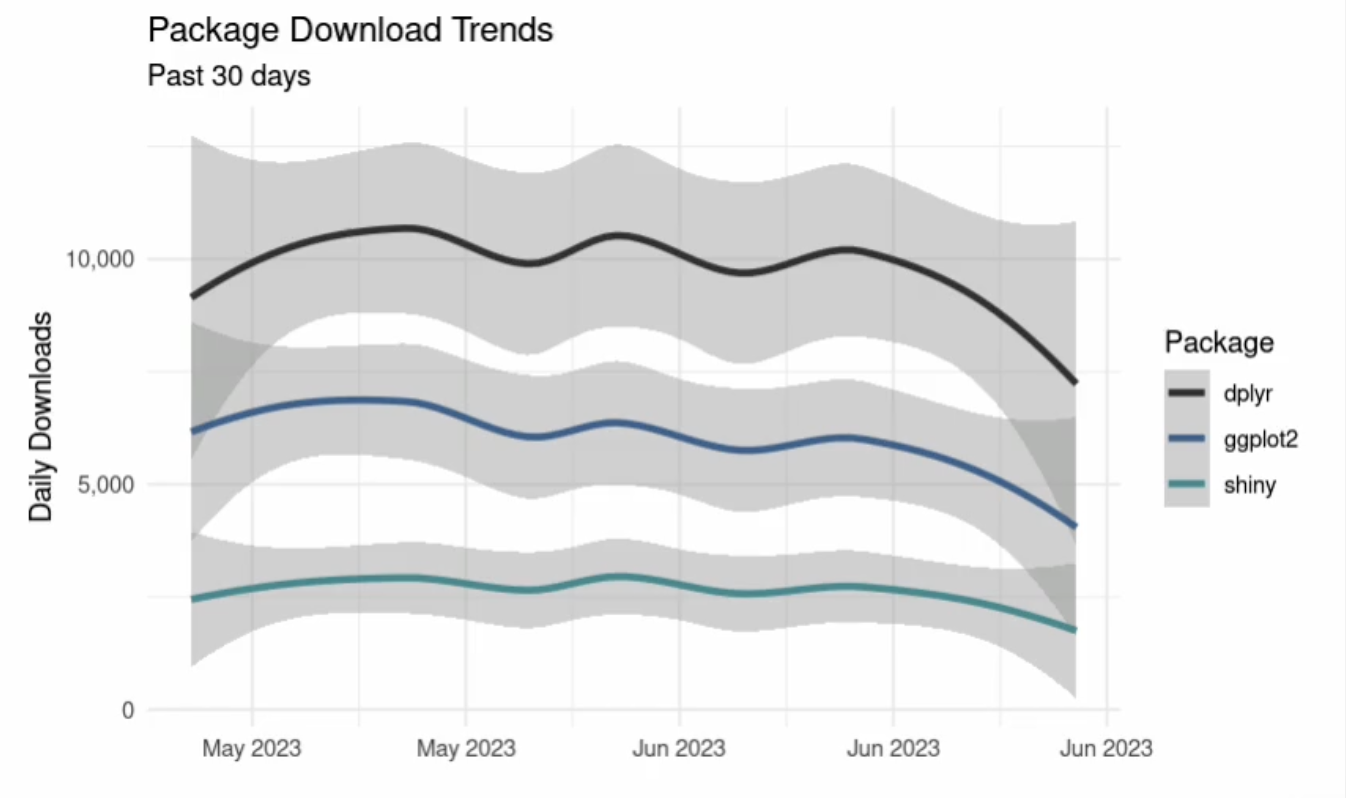
Since many of the viewers of this document won’t be interested in the code, you can also hide all of the code and any kind of messages for the final HTML output.
To do this, go back to very top of the document in your YAML and update to match the following:
---
title: "Quarto - Posit Theme"
format:
  posit-html: default
author: Ryan Johnson
date: last-modified
execute:
  echo: false
  warning: false
---
The code chunk options under execute will apply to all the code chunks in the document. “echo: false” will hide all the code from the output and “warning: false” will hide any warning messages.
Step 8: Publish your custom branded report to Posit Connect
Now that you have this final report, publish to Posit Connect as done in Step 3 by clicking the blue publish button within Posit Workbench. Publish this document with the source code to allow it to run on a schedule.
Ensure this Quarto document is scheduled to rerun so that it reads in that new pinned dataset (which is being updated every single day at 7 AM) and that it updates this report so that these numbers reflect the new package data every single day.
Set it to rerun daily at noon every single day (or whenever you choose) and go through the same workflow as shared in Step 5.
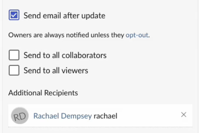
Since this Quarto document is the finalized report, you will also check the box to send an email notification to your colleagues to let them know the report was run. You have the option to send this email to all collaborators, all viewers, or specific recipients as shown below.
With that, you have successfully scheduled a Quarto document to Posit Connect - allowing you to share insights on constantly updated data in a beautiful report for stakeholders to access daily with the latest data.
Learn more about deploying data products to Connect
This example covered publishing and scheduling a Quarto document on Posit Connect, but you have many options when it comes to data products that you can deploy to Connect.
We’d love to have you join us at one of our monthly Posit Team Demos, where we walk through a different end-to-end data science workflow each month. They are on the last Wednesday of every month at 11 am ET on YouTube. You can add the event to your calendar here: pos.it/team-demo
If you have any questions and would like to talk with our team, you can schedule a time to chat here.
Interested in learning more about data workflows in Python or R? Join us at posit::conf(2023)! We have an amazing array of workshops and talks lined up. If you found this post interesting, check out these two options:
- Data Science Workflows with Posit Tools — R Focus led by Ryan Johnson and Katie Masiello: Ryan and Katie will discuss ways to improve your data science workflows! During the course, we will review packages for data validation, alerting, modeling, and more.
- Data Science Workflows with Posit Tools — Python Focus led by Gagandeep Singh and Sam Edwardes: During the course, Gagandeep and Sam will review packages for data validation, alerting, modeling, and more.

Rachael Dempsey
Related Content

What makes Posit different from proprietary analytics vendors

Deploying boosted tree models with Orbital
