Announcing Plotnine 0.15.0


Code - Imports
import pandas as pd
from plotnine.data import mtcars, penguins
from plotnine import (
   aes,
   coord_flip,
   element_rect,
   element_text,
   facet_grid,
   facet_wrap,
   geom_bar,
   geom_boxplot,
   geom_point,
   geom_sina,
   geom_smooth,
   geom_violin,
   ggplot,
   labs,
   scale_x_discrete,
   stat_ellipse,
   theme,
   theme_538,
)
I am having such a good time announcing plotnine v0.15.0.
In v0.13.0 when plotnine got a layout manager we anticipated greater things to come, well, the gates have opened and these are the days of our lives.
Plot Composition
A few months after the first public release of plotnine, we were haunted by the inability to combine different plots into a single graphic. Not anymore, we now have plot composition and it is built in.
Plot composition allows us to combine multiple independent plots into a single layout, where each subplot could be built from a different dataset, use different geoms, scales, or even themes.
It is about arranging whole plots by stacking them or side-by-side and not just slicing the data. The form and function is inspired by patchwork, and we have adapted the same algebraic symbols (operators). Kudos to Thomas.
p1 = ggplot(mtcars) + geom_point(aes("wt", "mpg")) + labs(tag="a)")
p2 = ggplot(mtcars) + geom_boxplot(aes("factor(cyl)", "mpg")) + labs(tag="b)")
p3 = ggplot(mtcars) + geom_smooth(aes("disp", "mpg")) + labs(tag="c)")
p4 = ggplot(mtcars) + geom_bar(aes("carb")) + labs(tag="d)")
composition = (p1 | p2 | p3) / p4
composition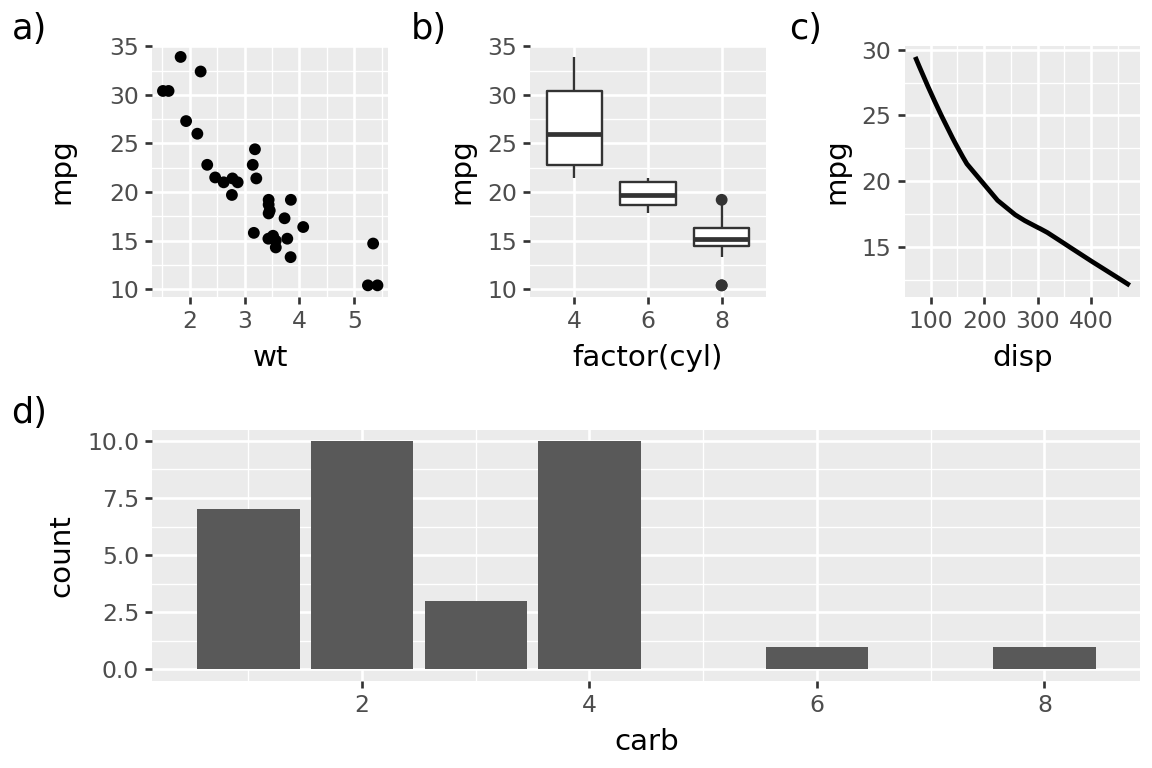
When you start combining multiple plots into a single figure, you quickly realise that you need an easy way to reference them. So we now have plot tags, as also shown in the above graphic. You do not have to tag any of the plots (or when you do, to tag all of them), but if you do, you can choose how to place and style them.
tag_theme = theme(
    plot_tag_location="inside",
    plot_tag_position="topright",
    plot_tag=element_text(color="gray", margin={"t": .1, "r": .1, "units": "lines"}),
)

composition & tag_theme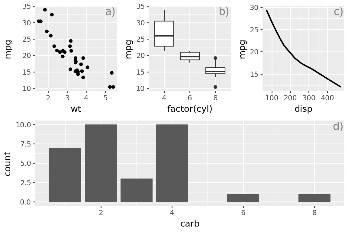
We have used the & operator to add a theme to all the plots in the composition. Check out the documentation to find out everything you can do. More is on the way.
Alignment, Alignment, Alignment
In announcing v0.13.0, we also showed off this plot.
Code
p = (
    ggplot(mtcars, aes("wt", "mpg", color="factor(cyl)"))
    + geom_point()
    + stat_ellipse()
    + labs(
        title="95% Confidence Interval Ellipses",
        subtitle="Understanding Variability in Two-Dimensional Data",
    )
)
p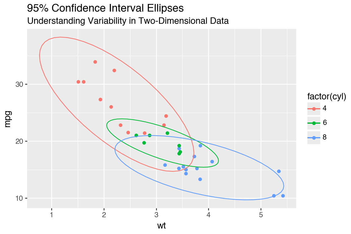
And said this:
These settings serve as defaults, but individual text alignments can be adjusted independently, so you have full control when you need it.
We were boasting because we had an esteemed Layout Manager, and we could align objects (title and subtitle in this case)! Yet beneath that, there was more shame than we could let on. Because if the panels of the plot do not have hard edges, you would probably really want to align the texts along something else. But you could not do it.
Code
p + theme_538()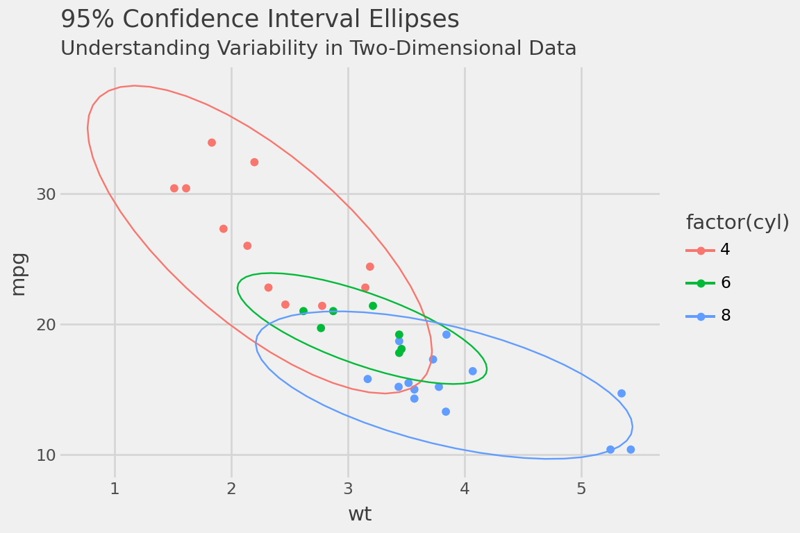
So little, yet it torments so much!
Now, you can align the titles with respect to the plot.
Code
p + theme_538() + theme(plot_title_position="plot")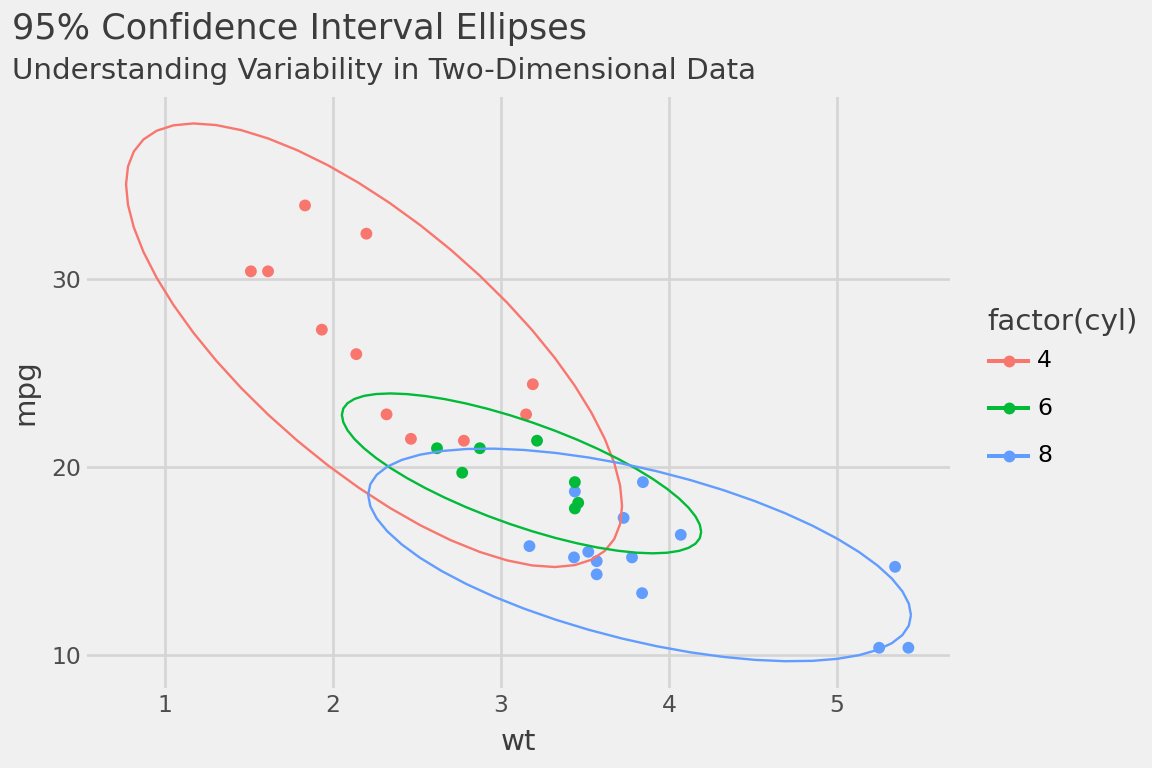
And you can align the plot caption with respect to the plot as well.
Facet strip improvements
All over plotnine, when it came to placing objects around the panels we went to great lengths to cater to the default theme settings. If you only lived in default-land, the world was created for you and no one could stop you, like the lucky creator of this plot.
Code
data = pd.DataFrame ({
    "x": "Lucky",
    "y": "Freedie",
    "horiz": ["A", "B", "A", "B"],
    "vert": ["short", "short", "looooooong", "looooooong"]
})

p = (
    ggplot(data, aes ("x","y"))
    + geom_point()
    + facet_grid(rows="vert", cols="horiz")
)

p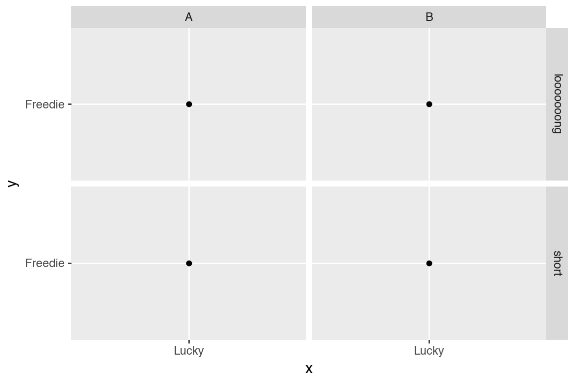
Then one time, they explored into the great beyond and rotated the facet strip-text.
p + theme(strip_text_y=element_text(rotation=0))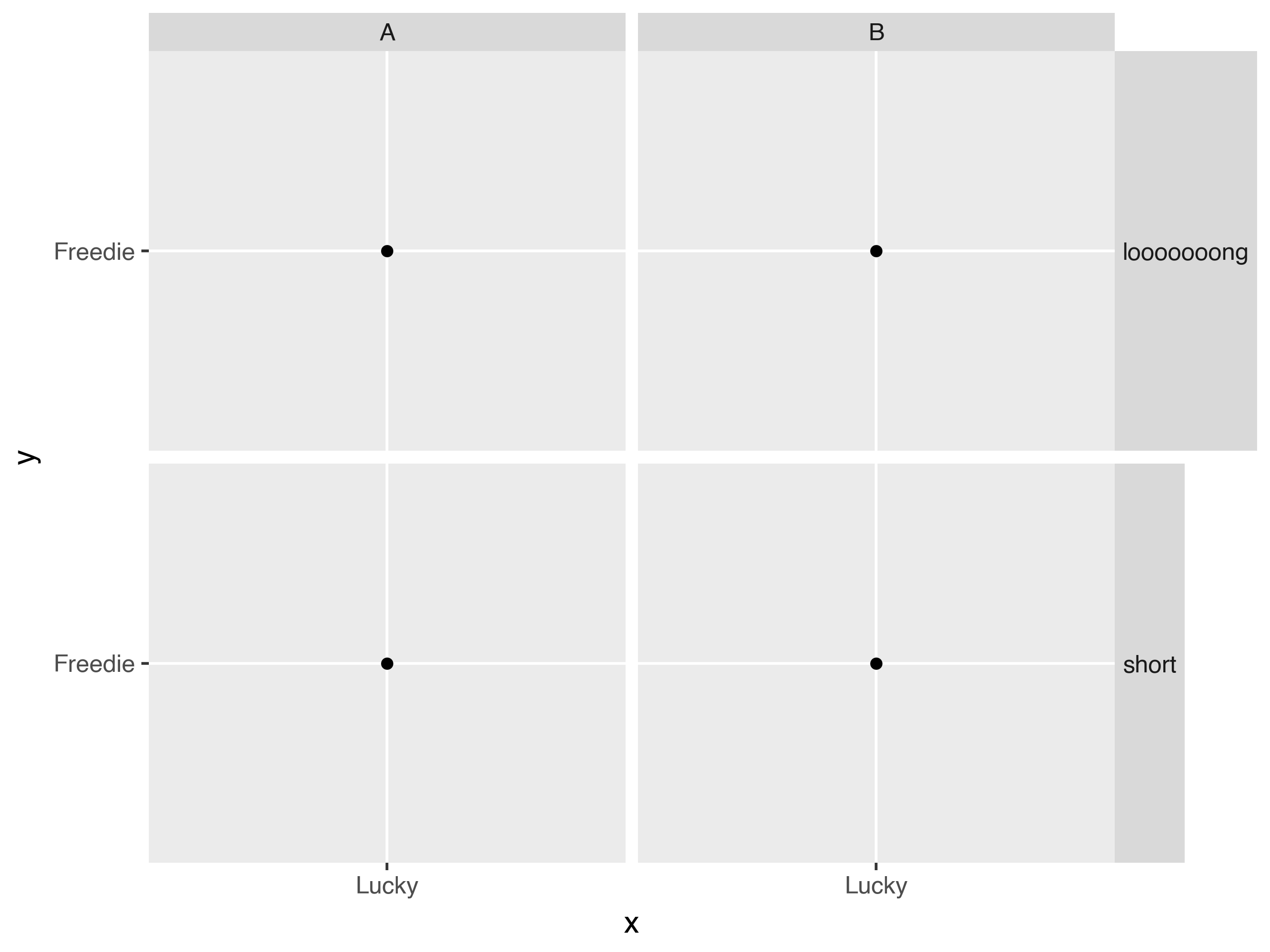
Still reaping the benefits of that tiny-tool, the Layour Manager, we have cleaned up a lot in the great beyond.
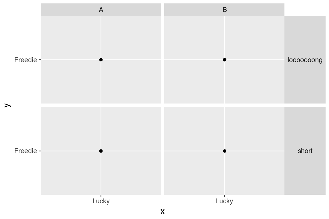
The strip texts and backgrounds have also had small but significant improvements.
Code
(
    ggplot(mtcars)
    + geom_point(aes("wt", "mpg"))
    + facet_wrap(("gear", "am"), nrow=1, labeller="label_context")
    + theme(
        strip_background_x=element_rect(fill=["green", "red", "red", "blue"], alpha=1/3),
        strip_text_x=element_text(linespacing=2, ma="right", ha=0.85),
    )
)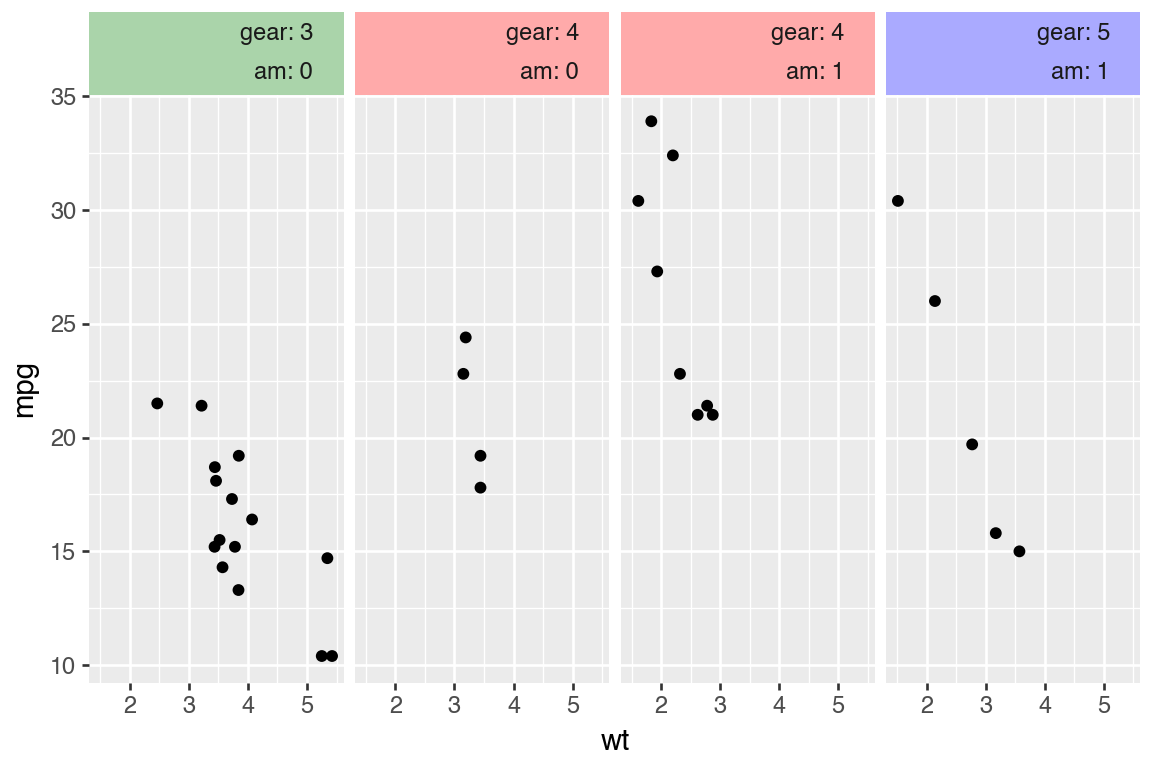
- The strip text has better default spacing and will also properly respond to the
linespacingparameter. - You can align the text horizontally along the strip using ratios.
- You multi-align the text.
- You can set some background or text properties per panel.
scale_color_hue switched to HCL color space
Working in HCL color space gives more perceptually uniform colors when only the chroma is varied at equal intervals. Previously, it used HLS color space.
See the difference.
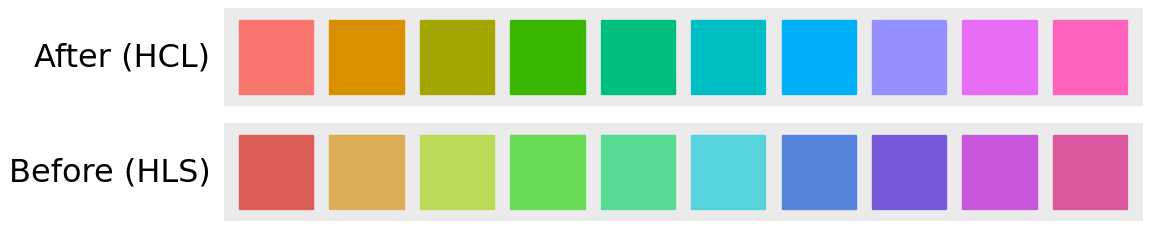
For the HLS colors, the greens (in the middle) are visibly lighter than rest!
This also affects the default scale for the color (and fill) aesthetics. It also matches the hue color space in ggplot2.
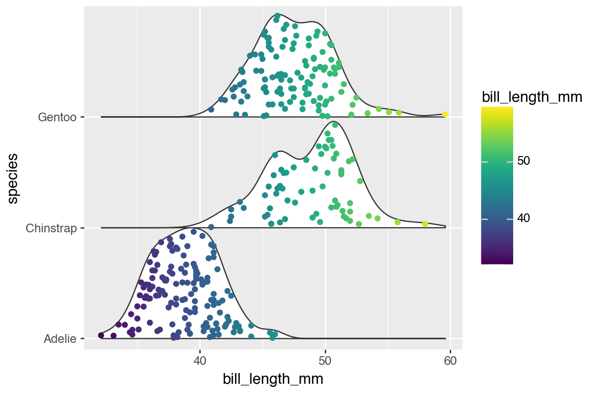
Ridgeline plots
geom_sina gained the style parameter similar to geom_violin which allows you to make one-sided distribution plots. Using the same value for the style with these two geoms you can easily create a Ridgeline plot.
Code
(
    ggplot(penguins.dropna(), aes("species", "bill_length_mm"))
    + geom_violin(position="identity", style="right", width=2, trim=False)
    + geom_sina(aes(color="bill_length_mm"), position="identity", style="right", maxwidth=2)
    + scale_x_discrete(expand=(0, -.9, 0, 0))
    + coord_flip()
)
Conclusion
While the headline features of this release are the new things and improvements that are powered by the Layout Manager, the changelog has plenty more. Among them are some small API tweaks to stats and geoms that make it easier to extend these types; they heard the anthem, and they too, want to be champions.

Hassan Kibirige
Related Content

Don't bring a spreadsheet to a data fight

Snowflake Native Apps vs. Connected Apps for financial services
