From Databricks to Posit Connect: Building and Deploying a Shiny for R Application


Last year, we announced a new partnership with Databricks to better integrate lakehouse access for data scientists. We held a webinar in December led by James Blair and Rafi Kurlansik. The webinar showcased how to use Posit Workbench to connect to a Databricks catalog. You can watch and read about the webinar in a previous post.
This post will walk through the UFO Shiny application that was demonstrated in the webinar. You can find all the code presented from the demo here: https://github.com/rstudio/databricks-ufo
Overview of the application
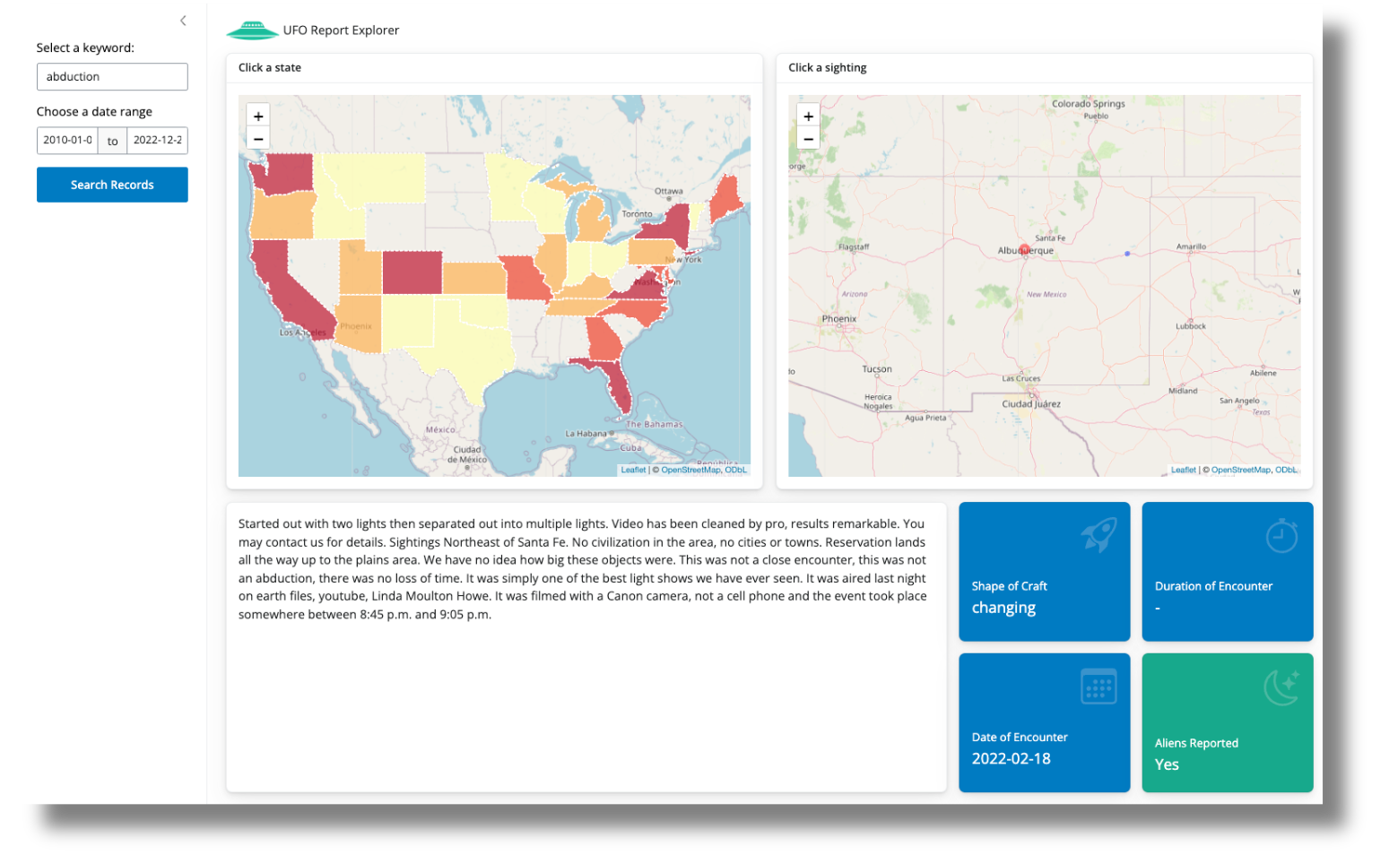
The National UFO Research Center (NUFORC) maintains a database of UFO sightings across the globe. The UFO application was created with Shiny for R. The UFO data contains user reports of UFO sightings across the world. Each sighting has a geolocation along with a description of the sighting.
The Shiny application aims to help you explore the actual UFO report.
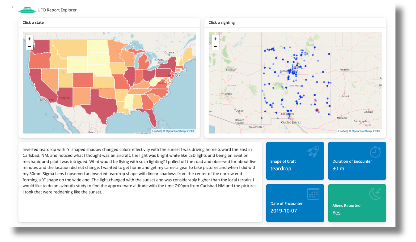
- You have an overall choropleth of the USA displaying the number of reports for each state.
- When you click on a state, the individual reports are plotted in the state to allow you to look into individual reports.
- As you click a point, the details of the report are shown
- along with some general information about the sighting, including the shape of the craft, duration of the event, date of the encounter, and whether or not the text description indicates an alien encounter.
- Filter the description text based on keywords
The application provides a basic search tool to filter on keywords in the description and narrow the dates of the encounter. The reactive programming of Shiny allows a change in the underlying data to propagate to the rest of the application.
The data
The current data has 14 columns and 141,258 observations. It is stored in a Databricks catalog and {sparklyr} is used to connect to the data. If you want to upload your own version of the data, you can search for and import the data into your own Databricks account. You will need to have the {sparklyr} and {pysparklyr} R packages installed on your machine and have your workspace instance URL, personal access token (PAT), and cluster ID from Databricks ready for the connection as well. From there, you can use the sparklyr::spark_connect() function to make the connection to the Databricks catalog.
library(sparklyr)

sc <- spark_connect(
  cluster_id = "Enter here your cluster ID",
  method = "databricks_connect"
)
You can see the README used in the webinar and the official Databricks connection documentation for more information on how to set up your system to connect to a Databricks cluster for your own Shiny application.
With the help of {tidyverse} and {dbplyr}, we can query and filter our data into our application just like a regular {dplyr} pipeline without having to write raw SQL strings. We can then use the resulting filtered data frame in the rest of our Shiny application.
Evolution of the application
Instead of a traditional dashboard that aims to present data and findings, we built a Shiny application to allow the user to explore individual reports and discover something in the data.
Creating the choropleth
The original data has UFO sightings around the entire world. But we wanted more detail than reports by country. The other reason was not knowing how each country subdivides itself (e.g., state, county, providence, etc), and finding the appropriate geospatial file for all the countries.
The plan was then to focus just on the continental USA where there are state breakdowns and further explore the individual points. We expected users of the application to be Americans and would look for areas directly relevant to themselves (e.g., where they currently live, their hometown, stereotypical UFO locations, etc.), and slowly drill down to a single sighting.
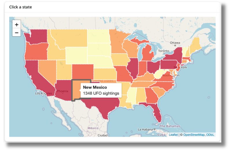
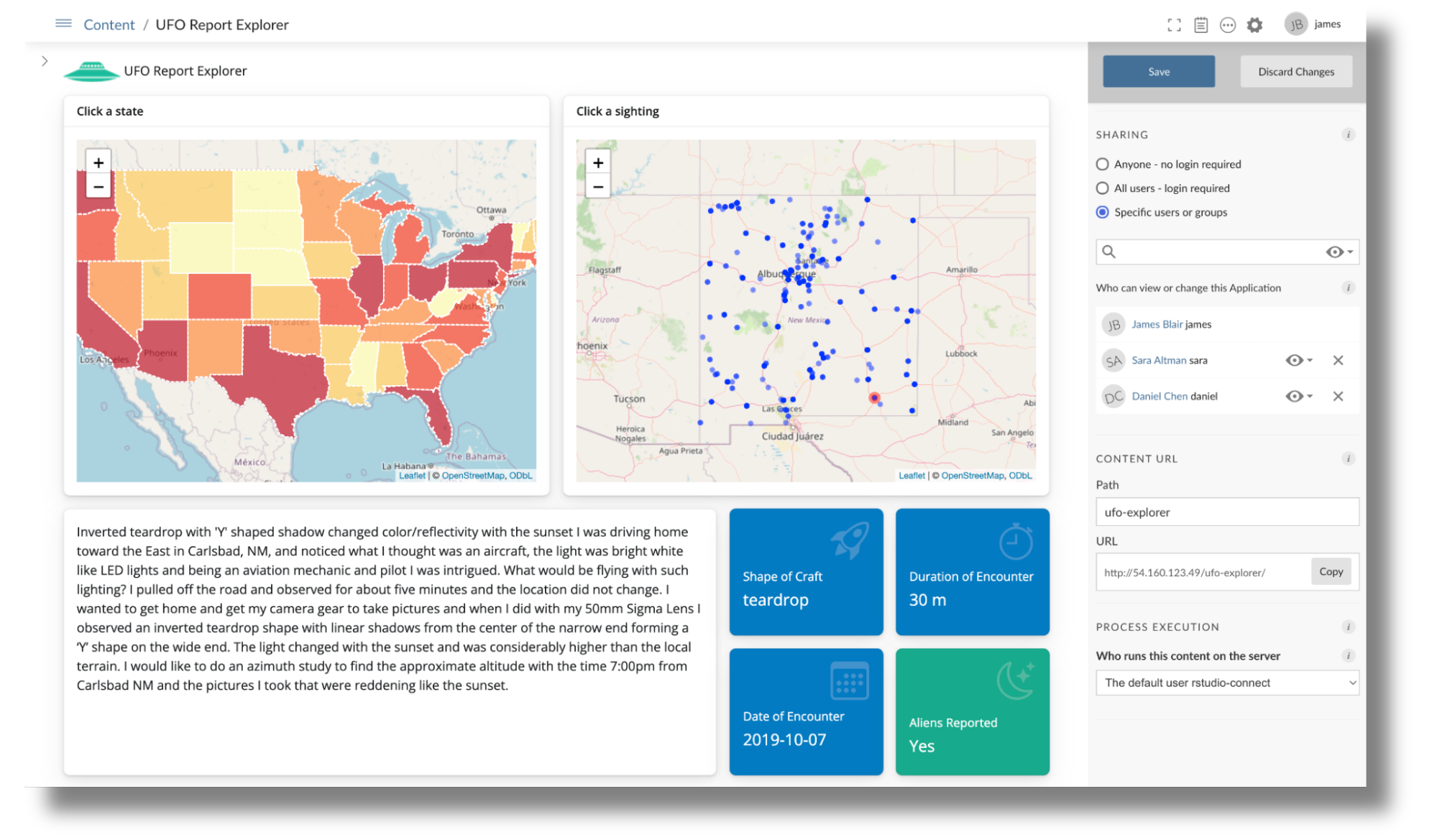
Providing the country-level choropleth gave the overall comparison between states and provided a means to provide state-level information on a click interaction. Shiny can interact with the {leaflet} package to react to clicks to make the rest of the reactive components in the application update.
We opted to show the overall counts at the state level because plotting all the observations in the country overplotted the points, and it was difficult to compare between states. Plotting the individual points at the state level gave a good balance between showing the total sightings and easily comparing them between states.
State observations
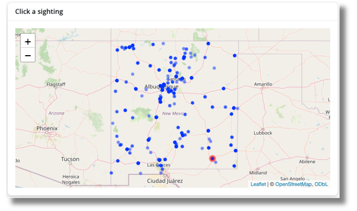
The overplotting issue at the country-level was alleviated by only plotting the observations at the state level. Since we are still using {leaflet} for plotting the observations, the user will be able to zoom into a specific geographic area to look for observations to click. The default OpenStreetMaps map overlay helps give context when exploring an unfamiliar region.
Separating out the state from the individual points is a cleaner way to show the information we wanted. Originally, we wanted to build off the SuperZip example, but it was impossible to clearly compare the relative number of observations between the 48 states. The choropleth and separate state plot made the exploration more linear and also gave us more room on the app to add in the text description of the sighting.
Individual reports
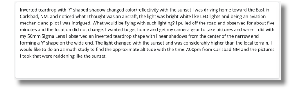
The individual reports were user-submitted text entries and had a wide range of lengths. This made it a bit tricky while planning the layout of the application because too little space would have a lot of scrolling or cut off the text, and too much space would create a lot of whitespace.
The layout of the application was mainly determined by how we wanted the text to be displayed. We had the two maps on the first row since that’s how English text is read, and a wide text area on the second row. This allowed any extra white space for smaller descriptions to be towards the bottom of the application and meant that there would be no awkward white space between elements of the application. The {bslib} layout allowed us to use the Bootstrap 12-grid system to layout the components, and also reflow in the order we want the user to interact with the application on a more narrow browser window.
Value boxes
Value boxes are a newer component in the {bslib} package. They allow us to provide quick bits of information into an application in an aesthetically pleasing manner. A lot of the information from the original data would be lost if we just showed the location and UFO sighting description. The value boxes allowed us to make use of the other columns in our data, mainly:
- The shape of the craft
- Duration of the encounter
- Date of the encounter
- Whether aliens were reported in the encounter
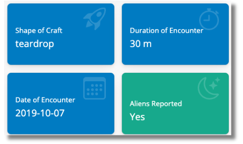
The value boxes provide an aesthetic way to bring attention to bits of information on the page. You can provide a title, value, image, and text in a valuebox. Since we wanted a way to distinguish between reports that reported alien activity from no activity, we needed to dynamically display the “Aliens Reported” value box with a different showcase image and text using the uiOutput() function.
The current version of {bslib} does not allow a reactive text input to be placed in the theme parameter of the value_box() component. So we created a reactive output component with renderUI(). Here we looked at the user description for the existence of alien related keywords, and if any of the keywords were detected, we would return a value_box() component with a green background with theme = "success" instead of the blue theme = "primary" that were used for the other value_box() components.
Filtering results
Since one of the value_box() components detected whether or not there were aliens reported in the selected sighting, we wanted to expand the ability for users to look for their own keywords. Shiny’s reactive programming means that we can shim in a keyword search to filter down the underlying dataset used for the application without needing to change the logic for the entire app. Since the data filtering parameters are not part of the main application, we wanted to hide the filtering features in a sidebar so it does not detract from the main application.
When working with a reactive textbox to filter data, unless the text returns a match, you will end up with an empty dataframe result that causes problems with the rest of the application. The same set of problems can happen if you mistype a word, do not type fast enough, correct a spelling error with backspace, etc. You can fix this issue by creating a “search” button that triggers the filtering only when the button is clicked. Since we also have a date range filter, we can set all the filtering variables before the application reactively responds to the user’s inputs. We do this by creating an actionButton() component in the UI, and looking for a button click with observeEvent() in the server. When there are no results, we also wanted to let the user know by displaying a dialog across the screen with modalDialog().
Challenges
The app requires the user to make 2 interactions:
- Click a state
- Click a UFO sighting
Without these interactions, there will be no text and value box summaries shown. Instead of showing just a choropleth map and empty boxes waiting for the user to interact with the application, we wanted to pre select a state and observation when the application loads. This also guides the user in exploring the application by providing an example of what they can see.
Redrawing the map and using Leaflet Proxy
The issue with preselecting a sighting is we needed a way to mark the sightings map with the particular sighting that the description text is showing.
What we can do (and originally did do) was add an additional circle marker to the leaflet map with addCircleMarkers(). However, this completely redraws the state and points leaflet map. This not only makes the application seem sluggish as the map redraws, but if you pan and zoom to click on a point, the zoom level also gets reset when the map is redrawn. The leafletProxy() function allows us to modify a map that has already been rendered, so we can make individual changes to a map without having to redraw the entire map. Using this function allows us to add a red marker on the map when the user clicks on a point to signify which UFO sighting description and value box are being shown in the application.
Tracking the currently selected point
When we are only using leafletProxy() to draw red circle markers on a user click, each click will result in a red dot, but all subsequent clicks will create more red dots without clearing the previous red point until the entire state map is redrawn when a state is clicked on the choropleth country map. In addition, simply removing the red marker on a new click, would remove the old sighting from the map entirely. So, as the user interacts with the state map, fewer points will be shown, and they will not be able to click on a previously clicked sighting.
To fix this, we need to actually track 2 points, the currently selected point, and the previously selected point. We can create two reactive values using reactiveVal() that track the current and previous values.
   ## initial sighting to display
    featured_sighting <- reactiveVal({
      ufos_usa |> filter(id == "30")
    })

    featured_sighting_previous <- reactiveVal({
      ufos_usa |> filter(id == "30")
    })
When a user clicks a point, the current sighting becomes the previous value, and the newly clicked point will take the place of the new current sighting.
    ## when the user clicks a sighting
    observeEvent(input$state_marker_click, {
      featured_sighting_previous(featured_sighting())
      featured_sighting(ufos_usa[as.numeric(input$state_marker_click$id), ])
    })
Now when we are using leafletProxy() each UFO sighting click will always redraw the previous sighting in the default blue color and draw the currently clicked point in red.
   observe({
      leafletProxy("state", data = featured_sighting()) |>
        leaflet::removeMarker(layerId = featured_sighting_previous()$id) |> # remove the precious marker
        addCircleMarkers(
          lng = featured_sighting_previous()$city_longitude,
          lat = featured_sighting_previous()$city_latitude,
          popup = featured_sighting_previous()$summary,
          label = featured_sighting_previous()$summary,
          radius = 1,
          layerId = featured_sighting_previous()$id
        ) |>
        addCircleMarkers(
          lng = ~city_longitude,
          lat = ~city_latitude,
          popup = ~summary,
          label = ~summary,
          radius = 5,
          layerId = ~id,
          color = "red"
        )
    })
This gives a user interface where it is always clear from the initial application load which UFO sighting description is being looked at. You can browse through the server.R file for the app for the full context.
Areas for improvement
Many of the sightings have locations that are geographically collocated. This is why some points look darker than others and makes it difficult to select an observation “behind” a clicked point. One way to address this issue is to use leaflet marker clusters by providing the clusterOptions parameter to addMarkers().
addMarkers(
  clusterOptions = markerClusterOptions()
)
One of the downsides of using marker clusters is setting the distance on what points are clustered together. Too high of a radius will group points far away from one another into a single cluster.
Publishing to Posit Connect
Now that the application has been developed, it’s time to make it accessible to others. The easiest way to do this is to publish the application to Posit Connect.
Applications like this one that depend on {sparklyr} and {pysparklyr} have certain requirements that need to be considered. For example, since {pysparklyr} depends on a local Python environment, a description of that environment must be included in the deployment so that Posit Connect can properly connect to Databricks. We also need to make sure that the appropriate environment variables are included to support connecting to Databricks. The pysparklyr::deploy_databricks() function helps simplify this process and makes it easy to deploy Databricks-backed applications to Posit Connect. Once the deployment is complete, we can further configure the application to allow access to only certain individuals as well as provide a dedicated path for accessing it:
Conclusion
Shiny provides a convenient way to expand a simple static report into a data exploration application. In this UFO sighting application, we provided a way for a user to explore the individual UFO sightings without having to code or look at the raw tabular data. The text and date filtering components we added to the application allow the user to subset the data and reactively modify what is displayed in the application.
This walkthrough highlights not only best practices for building interactive Shiny applications but also how to use the updated capabilities of {sparklyr} and {pysparklyr} to connect directly to Databricks and use data there. This pattern makes it possible to build insightful applications that are powered on the backend by the flexible and scalable compute of Databricks. Once an application has been developed, it can be published to Posit Connect for widespread distribution in order to maximize organizational impact.

Daniel Chen
Related Content

MCP Servers on Connect: Managing credentials and access

Score a Disease Surveillance Model Inside Snowflake, Without Moving
